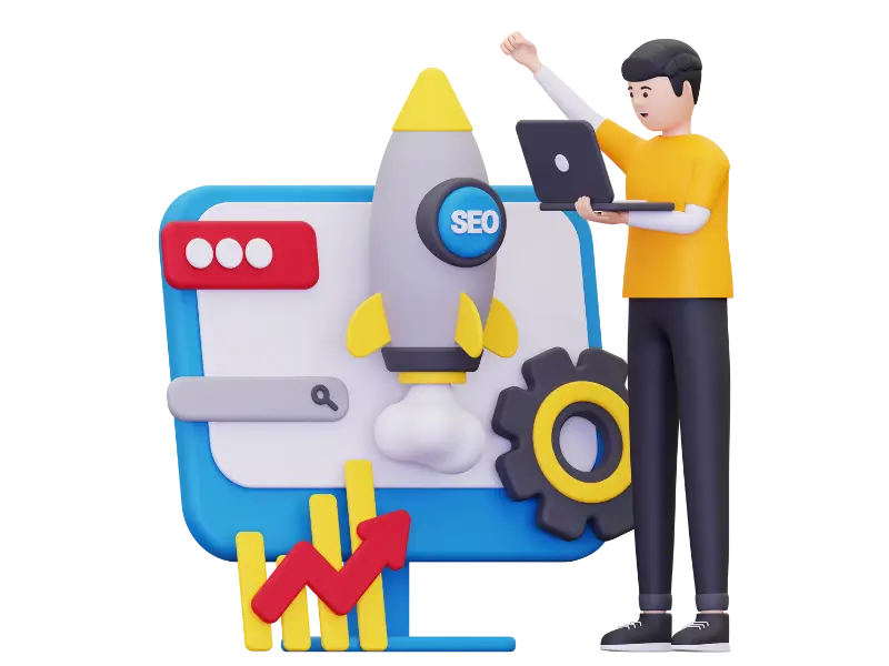
Understand How to Manage URL Parameters to Avoid Duplicate Content
Many medical websites have large libraries with hundreds of articles. As the library grows, visitors may find it harder to move from one page to another. If pagination is not clear, people can feel lost or unable to reach the information they need. Search engines also rely on clean navigation to crawl pages properly. Good pagination helps both users and search engines move through your library smoothly. It is a basic practice across the industry, something any healthcare SEO company understands well, and this guide explains how to improve it in simple words.
- Understand How to Manage URL Parameters to Avoid Duplicate Content
- 1. Why Pagination Matters In Medical Article Libraries
- 2. Common Problems Caused By Poor Pagination
- 3. How To Create Clear And Helpful Pagination
- 4. Improving Pagination For Better SEO And User Experience
- 5. Organizing Articles To Support Pagination
- 6. Designing Pagination For Mobile Users
- 7. Updating Pagination As Your Library Grows
- 8. Final Thoughts
1. Why Pagination Matters In Medical Article Libraries
Good pagination helps users and search engines move through many pages easily. When your article library grows big, poor pagination makes it harder to find important topics. Medical content usually covers many categories like symptoms, treatments, medicines, safety tips, lifestyle advice and long guides. If your pagination is unclear, users may miss valuable content.
Visitors who come to medical websites often need answers quickly. They may be searching for something urgent or something they want to understand clearly. Smooth pagination helps them find what they need without stress. It also helps search engines see all your articles so they can show them in search results.
2. Common Problems Caused By Poor Pagination
When pagination is not planned or organized properly, both visitors and search engines struggle to move through your medical content library. Poor pagination may seem like a small technical issue, but it can actually prevent users from finding useful information and stop search engines from understanding your website. This can make your entire medical library feel messy, harder to explore and less helpful overall.
2.1 Users Cannot Reach Older Articles
Most visitors only browse the first few pages of your article list. If older articles are hidden deep within many pages, users may never find them. When pagination buttons are unclear, too small or not easy to use, people usually give up before reaching the older content. This is a problem because medical articles often remain useful for years. They contain knowledge that can still help readers today. Poor pagination hides this value and reduces how long visitors stay on your website.
2.2 Search Engines Cannot Crawl All Pages
Search engines move through your website using the links you provide. If your pagination is confusing, missing numbers, looping incorrectly or not linking to all pages, search engines cannot crawl the full list of articles. This means some pages will not be discovered or indexed. Articles that are not indexed cannot appear in search results, which reduces the overall visibility of your medical library. Even helpful or high-quality articles may never reach the people who need them.
2.3 Users Become Tired When Navigating
If your pagination buttons are too small, placed in strange locations or designed without clear labels, visitors become tired of clicking through pages. Medical content already requires attention and focus, so the navigation should feel calm, clear and easy. When users feel confused or stressed by poor pagination, they leave the website instead of exploring more helpful articles. Good pagination guides users smoothly without making them think too much.
2.4 Important Content Gets Lost or Ignored
When pagination is weak, many articles end up sitting on deeper pages where almost no one visits. This causes valuable content—such as expert guides, treatment explanations or important health updates—to go unnoticed. Even if the article is well-written, it loses impact simply because users cannot find it. Poor pagination works like hiding books at the back of a shelf with no labels. Good pagination brings all pages forward so they can be easily discovered.
2.5 Bounce Rate Increases Due to Frustration
Visitors who cannot find what they want quickly often leave the website after viewing just one page. This increases your bounce rate and sends a negative signal to search engines. A high bounce rate suggests that users are not satisfied with the website experience. Poor pagination creates unnecessary frustration, making people click away even when your content is helpful. Clear pagination lowers frustration and encourages users to stay longer.
2.6 Duplicate or Repeated Content Becomes More Visible
When pagination is confusing or broken, some websites accidentally show repeated article lists or duplicated snippets on several pages. This happens when page numbers or sorting options do not work correctly. Duplicate content makes the user experience repetitive and also confuses search engines. A clean pagination layout prevents these issues by clearly separating each page and displaying unique content on each one.
2.7 Mobile Users Face Extra Difficulty
Poor pagination affects mobile users even more. Small screens make tiny buttons hard to tap, and long scrolling without clear page breaks makes navigation tiring. If pagination is not mobile-friendly, many visitors simply stop exploring because it feels uncomfortable. Since a large portion of users browse medical content on their phones, mobile-friendly pagination is essential. Clear, large and well-spaced page numbers make the experience smoother and more enjoyable.
3. How To Create Clear And Helpful Pagination
Optimizing pagination means arranging your article list in a way that is simple, predictable and easy for both users and search engines. You do not need complex designs or advanced technical features. What matters most is a clean structure that guides visitors from one page to another without confusion. Good pagination helps people find older articles, keeps the reading flow smooth and makes your medical library feel organized.
3.1 Use Clear Page Numbers
Page numbers are the simplest and most effective way to show visitors where they are inside your article list. When users see page numbers like 1, 2, 3 or higher, they immediately get an idea of how many pages exist. This helps them plan how far they want to explore. Clear numbering also lets them go back to a specific page later if they remember finding something helpful there.
Search engines also rely on numbered pages to crawl your site in a clear order. When the pages follow a predictable pattern, search engines can move from one page to the next easily. This reduces the chances of pages being skipped, ignored or marked as duplicates. The more understandable the structure is, the better your articles perform in search results.
3.2 Add Next And Previous Buttons
Next and Previous buttons are especially useful for visitors who prefer simple forward-and-back navigation instead of jumping between numbers. These buttons make the browsing experience feel natural, almost like turning pages in a book. They help guide visitors smoothly without forcing them to think too much about where to click next.
These buttons should be large enough and easy to see, especially on phones where most users browse today. When the buttons are easy to tap, people feel more confident moving through your pages. Good navigation helps reduce stress, keeps users focused and encourages them to explore more articles.
3.3 Keep Pagination At The Top And Bottom
Having pagination links at both the top and bottom of the page makes navigation much easier. Many visitors scroll down long lists of articles, and when they reach the end, they naturally want to move to the next page. If the pagination appears only at the top, they must scroll all the way back up, which feels annoying and slows them down.
Adding pagination at both places creates a smooth experience. It respects the user’s time and makes your website feel more user-friendly. This small change can greatly increase the number of articles your visitors read and help them enjoy your content without frustration.
3.4 Avoid Endless Scrolling For Medical Content
Endless scrolling loads new articles automatically as the user moves down the page. While this works for social media, it is not ideal for medical websites. Medical information requires focus, and endless scrolling can overwhelm visitors because the list never seems to end. They may lose track of which articles they have seen or accidentally scroll past something important.
Endless scrolling also creates technical challenges for search engines, since it does not clearly separate pages. Pagination creates small, manageable sections that allow users to take their time, move one step at a time and stay in control. It also makes indexing easier for search engines, which helps your content perform better.
3.5 Add a “Jump to Page” Option for Large Libraries
If your website contains hundreds of articles, clicking through each page one at a time becomes slow and tiresome. A “Jump to Page” feature helps users move directly to a specific part of your library. This is especially useful for students, researchers or returning visitors who already know what they are looking for.
This feature saves time and makes your library feel more advanced and organized. It also gives visitors a sense of control because they can reach the exact section they want without unnecessary steps.
3.6 Keep the Design Clean and Easy to Tap on Mobile
Since a large number of users read medical information on their phones, mobile-friendly pagination is very important. Buttons should be spaced well, large enough to tap easily and placed in familiar positions. Small or crowded buttons make mobile navigation frustrating and can lead to accidental clicks.
A clean and simple design makes your website feel modern and easy to use. It also helps older users, people with poor eyesight or visitors who are not comfortable with technology. When the pagination feels effortless on mobile, your website becomes more accessible to everyone.
3.7 Use Simple Labels So Users Do Not Get Confused
People should be able to understand your navigation instantly. Words like “Next,” “Previous,” “First,” and “Last” are easy to understand for users of all ages. They guide visitors naturally and help them feel confident moving from one page to another.
Avoid using confusing symbols or uncommon words, as they slow users down. Simple labels remove guesswork and make your structure feel friendly. This is important for medical platforms where users want clarity and quick access to information.
3.8 Show How Many Results Are On Each Page
Showing information like “Page 3 of 12” or “Viewing 10 of 200 articles” gives visitors a clear picture of how much content exists. It helps them understand the size of your library and decide how far they want to explore.
This small detail makes the browsing process feel more guided and predictable. It also reduces frustration because users know exactly where they are in the overall list and how much is left.
3.9 Use Consistent Pagination Across the Entire Website
Your website’s pagination style should look the same everywhere. When users see the same design, same buttons and same layout across all pages, they quickly learn how to navigate without thinking. Consistency builds trust and makes your website feel well-organized.
Search engines also benefit from a consistent design because it creates a simple pattern they can follow across your whole website. This improves crawling and helps every article get indexed properly.
4. Improving Pagination For Better SEO And User Experience
Good pagination is not only helpful for visitors but also plays an important role in improving your website’s SEO. When search engines can easily follow the structure of your article list, they understand your website better and can show your content to more people. Clear pagination also helps users move comfortably through your medical library, find older articles and enjoy a calmer reading experience. Improving pagination is a simple step that brings long-term benefits to both users and search engines.
4.1 Use Simple And Clear Page Links
Your pagination links should be short, clean and easy to understand. A simple structure like website.com/articles/page/2 is much better than long or confusing URLs with too many symbols. Clean links help search engines read the page order correctly and reduce the chance of errors. They also look more professional and trustworthy to visitors. When people see clear and predictable links, they feel confident and know what to expect when they click.
4.2 Avoid Duplicate Content In Pagination
Duplicate content can happen when the same article appears on multiple pages due to incorrect pagination settings. This creates confusion for search engines because they cannot tell which page is the correct version. To avoid this, make sure each page shows a fresh and organized list of articles. If you must repeat one or two items for continuity, keep it minimal. A clean list helps search engines index your content properly and makes your website look more reliable.
4.3 Make Sure Pagination Does Not Block Search Crawling
Some websites use special scripts, animations or designs that hide pagination links from search engines. When this happens, search engines cannot reach deeper pages, and important articles remain hidden. This hurts your rankings and reduces your visibility. To avoid this problem, always use simple text-based pagination that search engines can easily read and follow. When all pages are crawlable, your entire article library has a better chance of appearing in search results.
4.4 Add Canonical Tags To Avoid Confusion
Canonical tags help search engines understand which page is the main version when there are similar or repeated elements in pagination. Sometimes pages in a paginated list share small parts of the same content, which may confuse search engines. By adding simple canonical tags, you guide search engines toward the correct page and avoid ranking issues. Canonical tags help protect your SEO and keep your website clean.
4.5 Improve Page Speed For Paginated Sections
Pagination works best when pages load quickly. If users have to wait too long after clicking “Next,” they may leave before the new page appears. Slow loading also affects your SEO because search engines prefer fast websites. You can improve page speed by compressing images, reducing heavy scripts and keeping your design clean. Fast-loading pages make pagination feel smooth and help users stay engaged longer.
4.6 Keep Consistent Layout Across All Paginated Pages
Every paginated page should follow the same layout, style and structure. When users see a consistent design, they learn how to navigate without effort. Consistency builds trust and creates a familiar experience across your entire website. Search engines also benefit because they can understand your structure more easily. A stable and predictable layout makes your website feel organized and improves both user experience and SEO.
4.7 Use Structured Data To Help Search Engines Understand Your Pages
Structured data provides extra information to search engines about how your article list is organized. It helps them understand the order of pages, the type of content being displayed and how each paginated page is connected to the next. Adding structured data to your pagination makes crawling easier and improves the accuracy of indexing. This can increase your search visibility because search engines understand your pages more clearly and show them to the right users.
4.8 Test Pagination On All Devices Regularly
Pagination should work smoothly on desktops, tablets and mobile phones. Sometimes a design looks perfect on one device but becomes difficult to use on another. Buttons may appear too small, links may overlap or the navigation may shift out of place. Testing your pagination on different screen sizes helps you find these problems early. Regular testing ensures that every user, no matter what device they are using, gets a comfortable and easy browsing experience.
5. Organizing Articles To Support Pagination
Pagination works better when your article library is clean, structured and easy to move through. Simply having page numbers is not enough for a large medical website. Organizing articles properly helps users find what they need faster and reduces frustration. It also helps search engines understand the content layout and index more pages correctly.
5.1 Organize Articles By Clear Categories
Medical content should always be divided into categories that make sense for everyday readers. You can use broad, simple groups like symptoms, conditions, treatments, medicines, tests and wellness. When categories are easy to understand, visitors feel guided instead of confused. This reduces unnecessary scrolling and makes navigation smoother, especially for users who may already feel stressed or worried about their health.
5.2 Add Search Bar And Helpful Filters
Some visitors know exactly what information they want to read. A search bar allows them to reach the right article instantly without going through many pages. Filters such as Newest First, Oldest First, Most Viewed, Most Helpful or By Category make it easier for readers to refine their results. These tools support pagination by giving users multiple ways to get to the right content quickly.
5.3 Highlight Featured Or Important Articles
Certain articles, such as health warnings, new medical discoveries or important community updates, deserve special attention. Highlighting these articles at the top of the page or inside a clearly visible box helps users find valuable information faster. It also reduces the number of pages they need to navigate because important content is presented upfront where it is easiest to see.
5.4 Keep All Article Titles Clear And Easy To Scan
When your titles are long, confusing or too similar, users struggle to understand what each article covers. Clear titles help readers quickly recognize the content they need without opening multiple pages. Good titles also help search engines understand your topics, which can improve visibility. Simple, direct wording supports user experience and makes pagination feel more meaningful.
5.5 Remove Outdated, Repeated Or Low-Value Articles
Over time, large medical libraries gather old or repetitive content. These unnecessary articles make the library feel crowded and push important content deeper into the pagination. Regularly removing outdated posts, merging similar articles and updating old information keeps the library clean. A well-maintained library leads to cleaner pagination and a smoother reading experience.
5.6 Add Short Summaries Under Each Article Title
A small summary under each article helps users understand what the article covers before clicking. This reduces guesswork and makes browsing less tiring. Users do not need to open multiple pages to find what they are looking for. Summaries also help search engines understand your content better, making your paginated lists stronger and more organized.
6. Designing Pagination For Mobile Users
Most people search for medical information on their phones, which means your pagination must work smoothly on smaller screens. Mobile-friendly pagination helps users move through articles without stress, confusion or accidental clicks. When the design is simple and easy to tap, visitors stay longer, read more and feel more confident on your website.
6.1 Make Buttons Large And Easy To Tap
On mobile devices, small buttons often lead to mistakes because users may tap the wrong number or link. Making the buttons larger, with enough spacing between them, reduces frustration. Clear shapes, good contrast and readable numbers help users move through the pages without effort. Comfortable buttons make the entire reading experience feel calmer and more user-friendly, especially for people searching for important health information.
6.2 Keep The Layout Clean And Simple
Mobile screens have limited space, so cluttered designs can confuse users quickly. Avoid placing ads, banners, pop-ups or extra links near the pagination area. A clean layout makes the navigation stand out clearly, allowing users to move from page to page without struggling. Simple designs also help users stay focused and relaxed while reading medical topics that may already feel overwhelming.
6.3 Test Pagination On Different Devices
Phones come in many sizes, and what looks good on one model may look cramped or broken on another. Testing your pagination on multiple screens—small, medium and large—helps you catch display issues early. Fixing these issues improves the browsing experience and reduces bounce rates because users do not get frustrated by buttons that are too small, hidden or misaligned.
6.4 Keep Important Buttons Visible Without Excess Scrolling
Mobile users should not have to scroll too far to find the “Next,” “Previous,” or page number buttons. Keeping these navigation elements close to the bottom of the screen ensures they are always accessible. When users finish reading an article summary, the navigation should be right there, easy to reach. This reduces effort and makes moving through the library smooth and predictable.
6.5 Make Sure Pagination Loads Quickly On Slow Connections
Many mobile users browse on slow internet or weak signals. If pagination takes too long to load, users may leave the website. Keeping the pagination lightweight, avoiding unnecessary scripts and optimizing the mobile layout ensures that the pages load quickly. Fast loading builds trust and helps users feel more comfortable exploring more articles.
6.6 Use Clear Labels Instead Of Tiny Symbols
Some websites use small icons or arrows that are hard to understand on mobile screens. Instead, use clear words such as Next, Previous, Page 2, or More Articles. These labels tell users exactly what to do and prevent confusion. Simple language improves usability and makes your website friendlier for all types of readers, including older audiences or those unfamiliar with digital icons.
7. Updating Pagination As Your Library Grows
As your medical article library becomes larger, the way you organize pages must evolve too. Pagination that worked well when you had only a few articles may not work the same when you have hundreds or thousands. Regular updates keep your website easy to browse, help users find the right information faster and make sure search engines can still understand the structure clearly. This creates a better overall experience for everyone using your library.
7.1 Review Pagination Structure Every Few Months
When new articles are added, the page numbers and overall structure change. Reviewing your pagination every few months helps you spot problems early, such as pages becoming too long, categories growing unevenly or newer articles being pushed too far down. A quick check ensures that your library remains tidy, easy to follow and comfortable for users who rely on medical information to make decisions.
7.2 Remove Broken Or Hard-To-Reach Pages
Sometimes older pages become empty, have missing content or are not linked correctly. These pages make navigation confusing and may stop search engines from crawling your library smoothly. Fixing or removing these problem pages helps keep the entire system clean. It also ensures that users do not reach dead ends or outdated content when looking for health information.
7.3 Keep The Layout Fresh And Easy To Understand
Design trends change over time, and small improvements can make your pagination feel more modern and readable. Adjusting the spacing, button size, colors or text clarity can make a big difference for both mobile and desktop users. A fresh layout not only looks better but also helps users feel more comfortable while browsing medical topics that often require focus and clarity.
7.4 Update Categories And Tags As Topics Expand
As your library grows, you may introduce new subjects, treatments or medical conditions. Updating your categories and tags helps ensure that articles are grouped properly. When categories stay relevant and clear, users do not need to depend only on pagination to find what they need. This makes the entire browsing experience faster and more organized.
7.5 Check How Users Interact With Pagination
Understanding user behavior helps you improve your design. Checking analytics can show which pages users stop on, where they leave the site and how far they scroll. If users rarely reach deeper pages, it may mean that the pagination needs clearer labels, better placement or improved structure. Making changes based on real behavior leads to a more helpful and user-friendly library.
7.6 Add New Navigation Tools When Needed
As your article collection becomes very large, pagination alone may not be enough. You might need extra features such as “Jump to Page,” category shortcuts, or a stronger internal search tool. Adding these tools at the right time ensures visitors never feel lost or overwhelmed. It also helps them reach the exact article they want without scrolling through dozens of pages.
8. Final Thoughts
Good pagination makes a large medical article library easy to use. When visitors can move through pages smoothly, they find information faster and feel more comfortable on your website. Clear, simple pagination also helps search engines scan and index your articles, which improves visibility. Keeping everything organized builds trust and encourages people to stay longer. With regular updates, your medical library can stay useful, clear and user-friendly.