Understanding How to Optimize Virtual Consultation Pages for Higher Conversions
Every website that offers virtual consultations needs a strong and easy page that helps people understand what they will get and why they should book. Many pages stay confusing because they do not explain things clearly or they use very complex words that normal readers cannot understand. When the page does not guide people step by step, they leave quickly and look for another option. That is why it is important to talk in a simple way, show examples, and give clear instructions using tools that people already know. Even small details like colors, buttons, images, online booking apps, and short user stories can help visitors feel safe and ready to book a call. Some websites even use helpful platforms like Calendly, Zoom, Doxy.me, and Google Meet to make the process smooth, and those tools also help build trust when used the right way. Many teams that work on these pages look at real examples from clinics, coaching sites, or teaching pages, and they learn what makes people take the next step. When you plan your page in this simple and friendly style, it becomes easier for people to understand what you offer, and you can slowly make the page convert better without confusing anyone.
1. Building a Clear and Trustworthy Page Structure
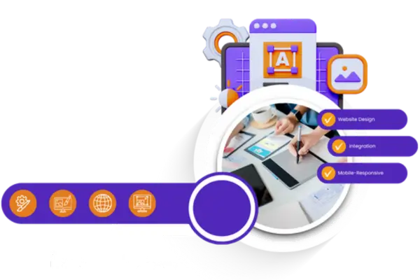
A clear page structure helps visitors find what they need without feeling lost, and this matters even more on a virtual consultation page because users want to know what happens before, during, and after the call. When you guide them with simple steps and show trusted platforms, the page feels easy to use. Right after the title, the introduction sets the mood and explains why the structure matters, and then the sub topics help break it into simple ideas. Many sites use tools like Canva, Figma, or Google Sites to plan the layout before adding it to the real website. This helps even small clinics or small coaching brands design pages without needing a large team. When people can follow the page like a smooth story, the chances of them booking increase because they feel everything is clear and safe.
1.1 Understanding What Visitors Expect on a Virtual Consultation Page
Visitors expect the virtual consultation page to tell them what they will get, how long it takes, and what tools are used for the call, and they expect all this in simple language. A page that hides details often makes people nervous because they cannot imagine what will happen. Many platforms use short demo videos or screenshots taken from Zoom, Google Meet, or Doxy.me so users can see how the call looks. It also helps to describe the steps clearly, like choosing a time slot, entering basic details, and getting an email confirmation. Some pages even show small examples of how the consultation helped someone else, and this makes visitors feel safe. When you answer common questions directly on the page, people stay longer and understand better. This also supports people who search for the page using terms like healthcare seo services because the clear content makes search engines understand the purpose of the page.
1.2 Using Trust Elements Like Images, Logos, and Real Examples
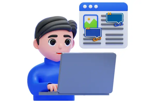
Trust elements make the page feel real, and users often look for signals like platform logos, safe payment icons, or pictures of real team members. When a page only uses stock images, visitors sometimes feel unsure because it looks too generic. That is why many websites use real screenshots from the apps they use like Calendly booking screens or Zoom waiting room screens. These small touches make people feel familiar because they may have used those tools before. Many pages also add short lines about privacy and data protection, and this helps people feel their information is safe. When users see trust marks or read a simple example story of how the consultation helped someone, they start imagining how it might help them. Even showing a few awards or years of experience in simple words can help build confidence. This type of trust design increases conversions gently without forcing anything on the visitor.
1.3 Creating Easy Navigation That Guides Visitors Smoothly
Navigation on a virtual consultation page should feel simple, and users should move through the page naturally without jumping around. Some websites use floating menus or small sticky buttons that remain on the screen so users can click “Book Now” whenever they are ready. This makes booking feel easy and always available. Many builders like Wix, WordPress, and Squarespace have easy drag-and-drop tools that help create smooth sections. When visitors scroll, each part should feel connected like a story instead of separate blocks. Navigation also becomes better when pages avoid too many links because those can distract visitors. When everything is in simple steps on one page, people stay longer and feel more comfortable. This kind of flow increases clarity and reduces confusion for first-time users.
1.4 Explaining the Booking Process in a Simple and Friendly Way
A clear explanation of the booking process helps people feel ready because they know exactly what will happen. You can describe how they choose a slot, what information they share, and how they receive confirmation. Many sites use booking tools like Calendly, HubSpot Meetings, or Acuity Scheduling to automate the process and send reminders. Showing how these tools work through short text or small screenshot examples makes visitors feel confident in using them. Users also appreciate when you mention how long the consultation lasts and whether they need any documents or photos. When the explanation stays simple and friendly, readers do not feel stressed. A good booking explanation turns a worried visitor into someone who feels ready to click the button.
1.5 Making the Page Load Fast and Work Smoothly on Mobile Devices
A fast and mobile-friendly page helps users reach the booking button without waiting or facing layout problems. Many people open consultation pages on phones, so the design should look balanced on small screens. Tools like Google PageSpeed Insights or GTmetrix help check speed and show what needs fixing. Slow images, heavy videos, or too many scripts can make the page freeze, and this makes users leave. When images are compressed and scripts are simplified, the page loads quickly even on slow internet. Mobile optimization also means big buttons, readable text, and clean spacing. When users can scroll smoothly and everything loads quickly, they feel comfortable and happy to continue.
1.6 Using Simple Words to Explain the Purpose of the Consultation
Simple words help people understand what the consultation is about, and it prevents confusion for visitors who may not know technical terms. This makes the page friendly for all ages, even younger readers. Many websites use tools like Grammarly or Hemingway to keep sentences simple and easy to follow. It also helps to give real examples of what happens during the consultation, like asking questions, reviewing problems, or giving guidance. This helps people imagine the call clearly. When visitors see simple explanations, they trust the page more because it feels honest. A good page always focuses on clarity instead of fancy wording, and that clarity increases conversions slowly and naturally.
2. Improving Engagement and Encouraging Visitors to Book
A virtual consultation page becomes more effective when it engages visitors through helpful content, tools, and interactive elements that guide them toward booking. Right after the title of this section, the introduction explains the importance of engagement in simple words so visitors understand why each detail matters. Many websites use simple quizzes, short videos, or interactive chat boxes to keep users interested, and these tools help them make decisions. When the page feels active and easy to explore, visitors stay longer and feel more prepared. Engaging elements also help highlight benefits without forcing anything, and they allow users to learn at their own pace. This soft and simple guidance helps them feel ready to book a call.
2.1 Adding Helpful Videos That Explain the Consultation
Videos help visitors understand the consultation better because they get to see how things work instead of only reading about it. Even a short video recorded on a phone can explain the steps clearly and make the page feel warm and friendly. Many websites use YouTube or Vimeo to embed videos so they load faster and do not slow down the page. A simple walkthrough of the booking steps or a short message from the team can make people feel comfortable. When videos show real people and real tools like Zoom or Google Meet screens, visitors feel more familiar with the process. Videos also help users who prefer watching instead of reading long text, and this keeps them on the page longer. With more time on the page, users often start trusting it more and become ready to book.
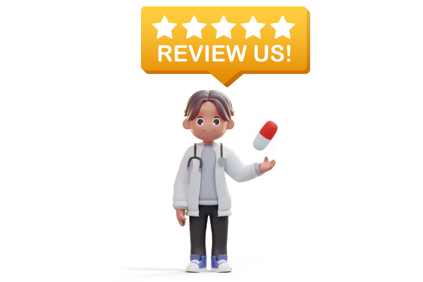
2.2 Sharing Real Stories and Examples of Successful Consultations
Real stories help visitors relate because they see how the consultation helped someone with a similar problem. These stories do not need magical results or dramatic changes; they only need to be simple and honest. Many websites collect reviews through tools like Trustpilot, Google Reviews, or Facebook Reviews, and they display small parts of them on the consultation page. When people read how someone solved an issue through the call, they feel hope that they can get help too. It also helps to mention the tools used in the story, like how someone shared documents through Google Drive or showed photos during a Zoom call. These details make the story more real and easier to imagine. When visitors connect emotionally with these examples, they slowly feel more confident to book their own call.
2.3 Using Interactive Tools Like Simple Chat or Quick Question Forms
Interactive tools help visitors get answers quickly without needing to search through the whole page. Many sites add small chat boxes using tools like Tidio, Intercom, or LiveChat so visitors can ask short questions. Even automated chats that answer basic questions make users feel supported. Some websites also use simple question forms that help visitors explain what they need, and this makes the upcoming consultation more meaningful. When users interact with these tools, they feel like the site is active and ready to help them. This interaction keeps them engaged for a longer time, which increases the chances of booking. These tools also work well on mobile devices, making it easier for people to use them anywhere.
2.4 Showing Clear Pricing and What Is Included in the Consultation
Clear pricing helps visitors know what they will pay and what they will receive, and it reduces nervousness about hidden fees. Many pages list what is included in the consultation, like call duration, follow-up notes, or extra resources. Tools like Stripe and PayPal help websites show trusted payment logos that make users feel safe. Some sites also allow users to pay after booking through invoicing tools like Square or Wave, which gives them more flexibility. When visitors see simple and open pricing, they feel the business is honest. This honesty helps build a comfortable feeling, and that comfort often leads to more bookings. Even small explanations like why the price is fair can help people feel secure about their decision.
2.5 Adding Simple FAQs That Answer Common Questions
FAQs help visitors get fast answers to common questions, and they prevent confusion about the process. Each answer should stay simple without long technical explanations. Many websites use collapsible FAQ boxes built with tools like Elementor, Wix Editor, or Webflow. These boxes save page space and look neat on mobile screens. When visitors see answers about call duration, what to bring, payment rules, or cancellation steps, they feel more prepared. FAQs also help search engines understand the page better, which can bring more visitors over time. When questions and answers stay clear and friendly, users feel like the team understands their concerns. This feeling helps build trust and encourages them to book the consultation.
2.6 Using a Strong and Simple Call-to-Action That Guides the Visitor
A clear call-to-action helps guide visitors to the next step, and it should stay simple so they know exactly what to do. Buttons like “Book Your Call” or “Start Your Session” work well because they explain the action in basic words. Many sites use scheduling tools like Calendly or Acuity to link these buttons directly to the booking page. A strong call-to-action should appear more than once on the page so visitors can click whenever they feel ready. When the button is large and easy to see, users do not struggle to find it. It also helps when the colors match the page theme so the design feels friendly. A simple call-to-action makes the last step feel easy and natural, and this helps improve conversions.
3. Conclusion
A virtual consultation page works best when it stays simple, clear, and helpful, and this lets visitors understand everything without feeling confused. When you use real examples, trusted tools, and friendly wording, the page feels warm and easy to follow. Each part of the page should guide the visitor gently toward booking by explaining the process and making them feel safe. When users can imagine how the consultation will help them, they take the next step with confidence. Simple structure, real stories, smooth navigation, and honest details all work together to create a page that converts better. By focusing on easy explanations and thoughtful design, anyone can build a virtual consultation page that feels welcoming and encourages people to book.