Build Your FAQ Page Using Free FAQ Templates with Prebuilt Code
Building an FAQ page is a helpful way to guide visitors and answer common questions in one clear place. Using FAQ templates gives your page a ready structure, making it easier to arrange questions and share answers in a simple and easy-to-read format that feels welcoming.
A clear FAQ page helps visitors move through your website without effort. When questions and answers are placed in a logical order, people can quickly find what they need and feel more comfortable as they explore your content and learn more about your site.
As your website grows and changes, keeping the FAQ page organized becomes more important. FAQ templates support this process by making it easier to update answers, add new questions, and maintain a clean and consistent layout over time.
What is an FAQ?
FAQ stands for Frequently Asked Questions. On a website, an FAQ is a dedicated place where you answer the most common questions customers ask about your product, service, pricing, delivery, account, or policies.
A good FAQ is not just a list of random questions. It is a self-service layer that helps people move forward without waiting for support. Sometimes that means helping a visitor decide whether to buy. Sometimes it means helping an existing customer solve a problem quickly. Either way, the job is the same: reduce confusion and remove friction.
How FAQ Pages Improve Customer Support and Customer Experience
A strong FAQ page is one of the easiest ways to improve support without hiring more people. It works because it handles repetitive questions before they become tickets.
When the same questions hit your inbox every day, your support team spends time repeating the same answers. That slows down response times for harder issues. An FAQ page pulls those repeat questions out of the queue and gives customers answers immediately.
It also improves the customer experience in a quieter way. A buyer who feels uncertain often leaves. The uncertainty can be small, like shipping times or return rules, or it can be bigger, like whether your tool works with their setup. An FAQ solves that uncertainty at the exact moment it appears, which reduces hesitation.
FAQ Templates with Ready-to-Use HTML and CSS Code
A well-organized FAQ section helps visitors find answers quickly and understand your website more easily. Here are some ready-to-use FAQ templates with HTML and CSS code, so you can choose the style that fits your website and customize it to match your design.
Bento FAQ Template
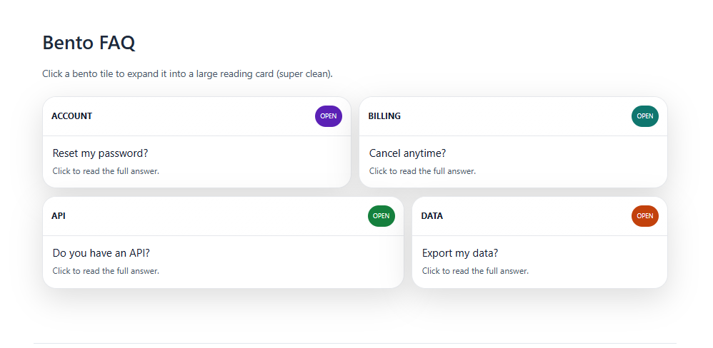
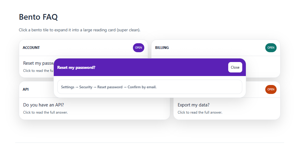
The Bento FAQ Template presents questions and answers as clean, tile-like blocks in a grid. This FAQ template makes content easy to scan visually instead of scrolling a long list. Each tile can show a small icon, short title, and quick summary. It’s great for modern landing pages that want structure and style together.
Bottom Sheet Template
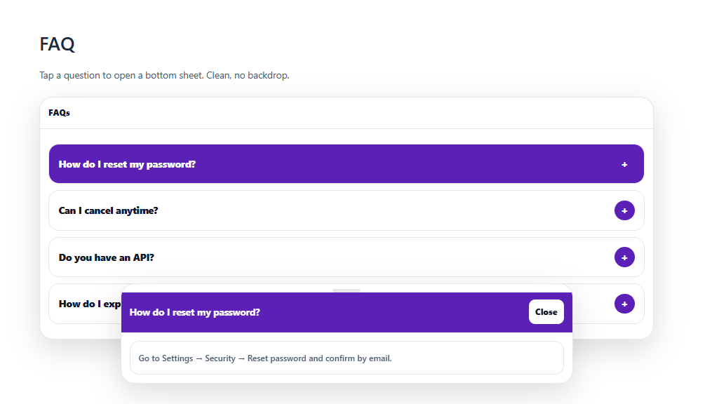
The Bottom Sheet FAQ Template slides up from the bottom of the screen like a mobile panel. This FAQ template keeps the main page clear while still giving quick access to help. Users can tap to open, scroll through answers, and swipe or close when done. It works especially well for mobile-first products and in-app support.
Stripe Cards FAQ Template
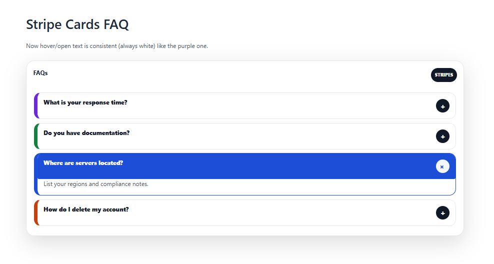
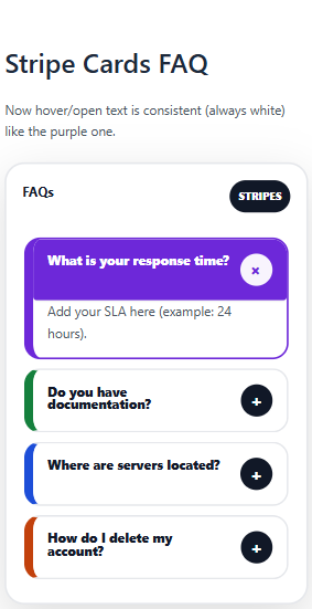
The Stripe Cards FAQ Template uses simple, minimal cards with strong typography and spacing. This FAQ template feels clean, reliable, and product-focused. Each card holds a question and short answer that’s easy to skim. It fits SaaS, fintech, and any brand that prefers a polished, professional look.
Cards + Modal FAQ Template
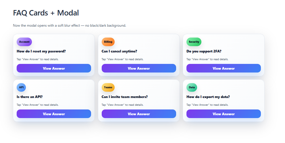
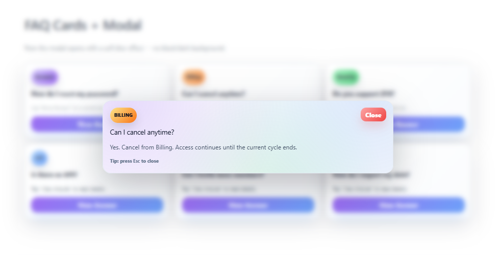
The Cards + Modal FAQ Template shows questions as cards and opens answers in a modal. This FAQ template keeps the main page short while still supporting long, detailed responses. Users click a card to see full content without losing their place. It’s ideal when you have rich FAQs but want to avoid endless scrolling.
Ribbon Stack FAQ Template
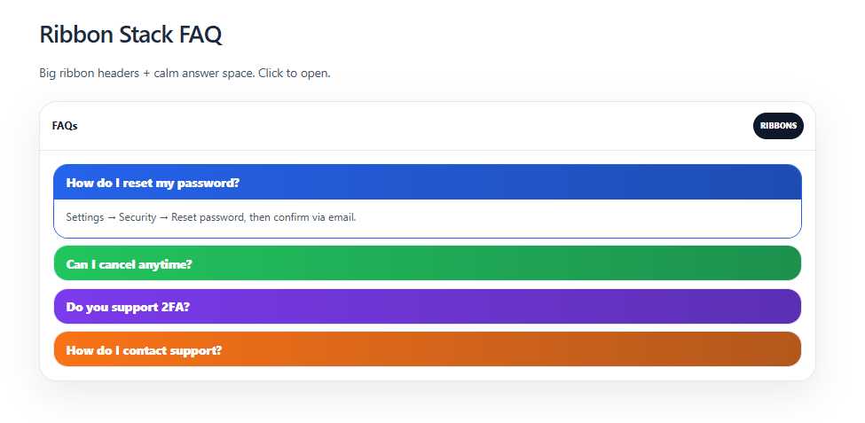
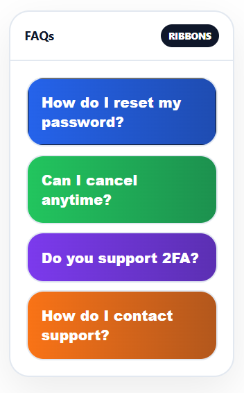
The Ribbon Stack FAQ Template arranges questions as horizontal ribbons stacked on top of each other. This FAQ template lets each ribbon expand downward to reveal the answer. The layered look adds structure and a bit of visual flair. It is useful when you want to highlight certain questions but still show the full list.
Stacked Deck FAQ Template
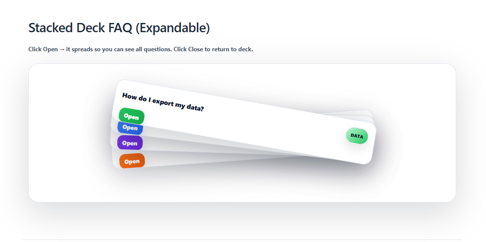
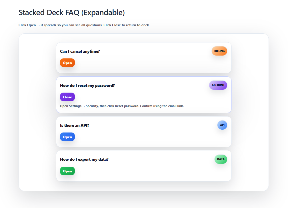
The Stacked Deck FAQ Template makes questions look like overlapping cards in a loose deck. This FAQ template feels playful while still being clear to read. Users are drawn to click the top card and then move through the stack. It suits creative, fun brands that still need organized information.
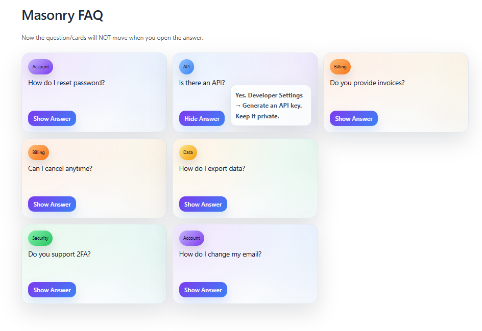
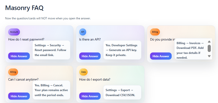
Masonry FAQ Template
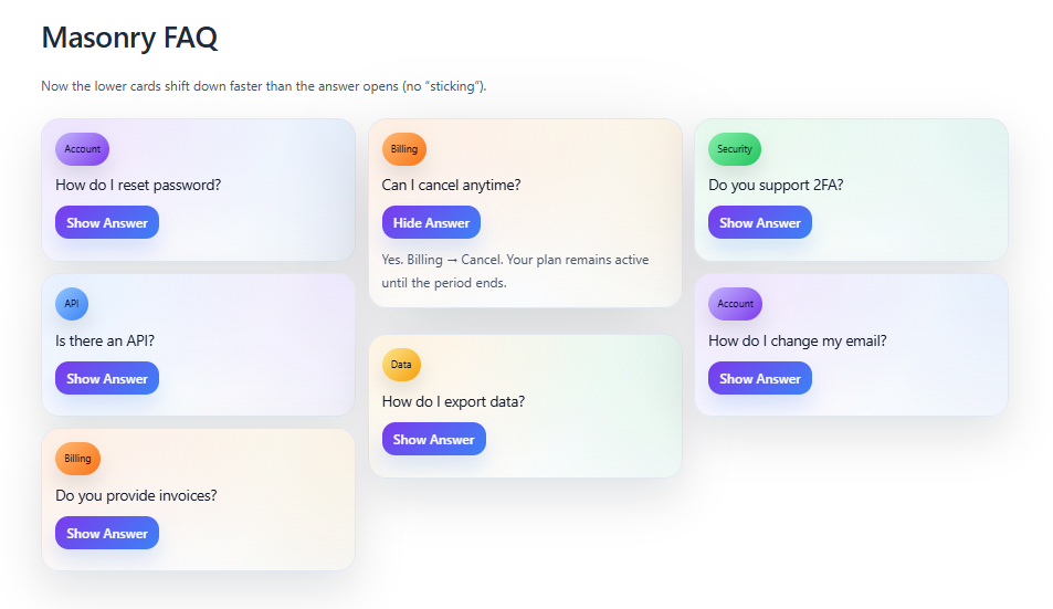
The Masonry FAQ Template arranges questions and answers in a Pinterest-style grid. This FAQ template handles short and long answers side by side without wasted space. The uneven block heights make the layout feel dynamic and exploratory. It’s great when you have many FAQs and want a more visual experience.
Categorized Pills FAQ Template
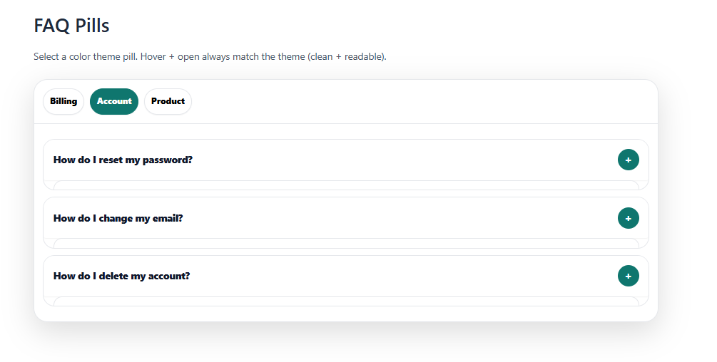
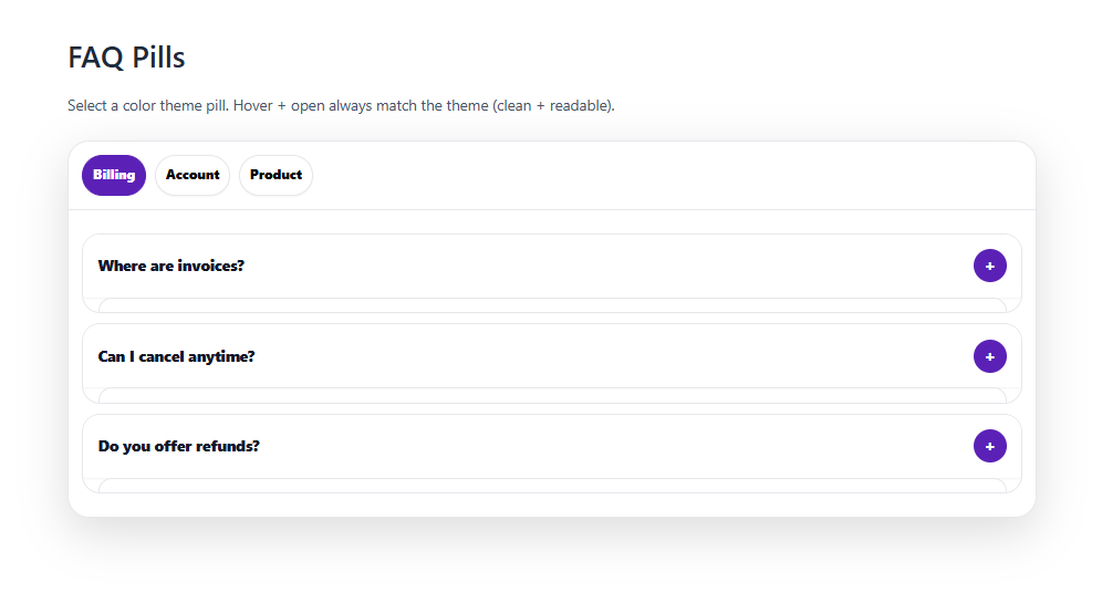

The Categorized Pills FAQ Template shows categories as pill-shaped filters like “Billing” or “Account.” This FAQ template lets users tap a pill to instantly filter visible questions. It keeps navigation fast and simple, especially on mobile. It’s perfect when your FAQ is large but clearly divided into a few key groups.
Stepper Sidebar FAQ Template
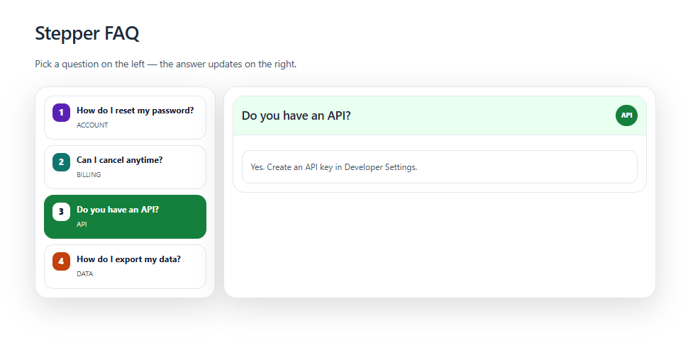
The Stepper Sidebar FAQ Template organizes content into steps such as “Start,” “Setup,” and “Troubleshooting.” This FAQ template guides users through a sequence instead of a flat list. Each step in the sidebar reveals related questions on the main area. It’s ideal for onboarding flows or multi-stage processes.
Sidebar Categorized Accordion FAQ Template
 (1)")
")
")
The Sidebar Categorized Accordion FAQ Template uses a left sidebar for categories and an accordion for questions. This FAQ template lets users pick a category first, then expand individual questions. It keeps long FAQ collections from feeling overwhelming on one page. It works well for products with many topics and subtopics.
Timeline Sidebar FAQ Template
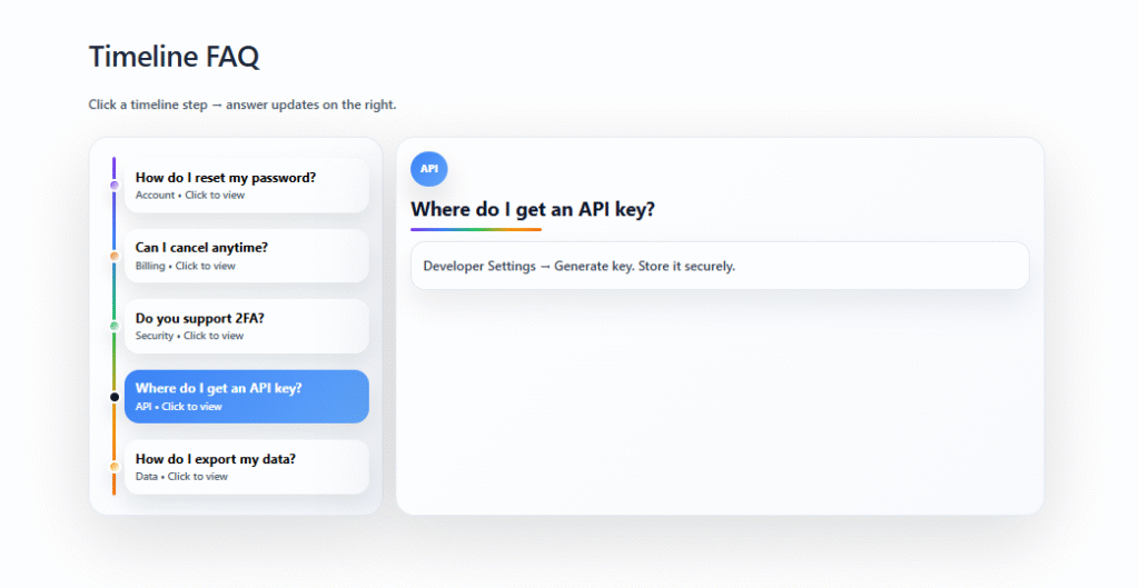
The Timeline Sidebar FAQ Template arranges FAQs along a timeline, such as “Before Purchase,” “During Setup,” and “After Launch.” This FAQ template helps users see which questions matter at each stage. A sidebar or vertical line marks each point in the journey. It’s great for lifecycle-based support and product journeys.
Masonry Ans Side Open FAQ Template
The Masonry Ans Side Open FAQ Template uses a masonry grid for questions and opens answers on the side. This FAQ template keeps the grid visible while showing the selected answer in a fixed panel. Users can click different tiles and see content update without losing context. It suits content-heavy FAQs where quick comparison matters.
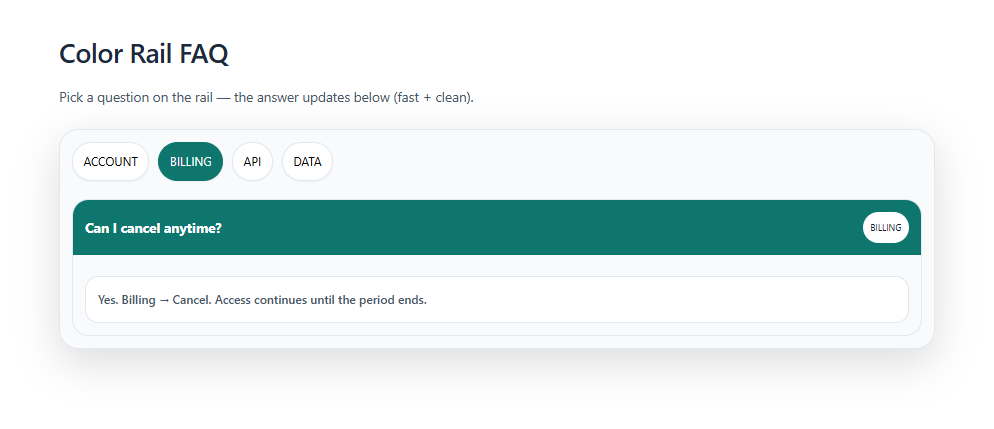
Color Rail FAQ Template
")
The Color Rail FAQ Template features a bold colored rail or strip along the side of each question group. This FAQ template uses color to separate sections like “Billing,” “API,” or “Data.” It makes scanning and remembering categories much easier. It’s useful for brands that want both structure and strong visual identity.
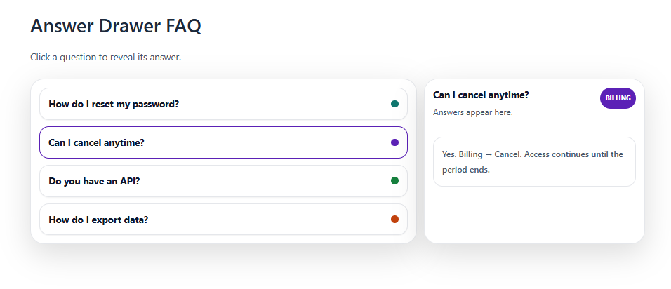
Answer Drawer FAQ Template
")
The Answer Drawer FAQ Template lets each question open like a sliding drawer beneath the title. This FAQ template keeps the layout compact while still showing full answers on demand. Users can open multiple drawers at once or close them to clear the view. It’s ideal when you want simple, intuitive interactions without extra clutter.
Gradient Pastel Light FAQ Template
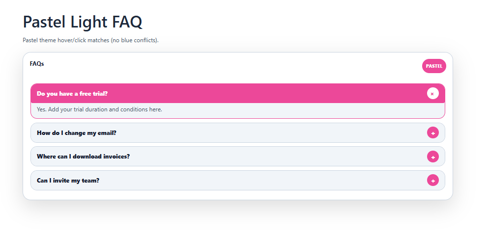
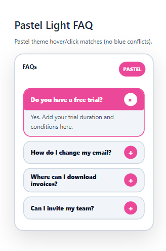
The Gradient Pastel Light FAQ Template wraps your questions and answers in soft, blended pastel backgrounds. This FAQ template feels calm, friendly, and easy on the eyes. Light gradients separate sections without hard lines or heavy borders. It’s perfect for modern brands that want a gentle, welcoming support area.
Card Slider FAQ Template
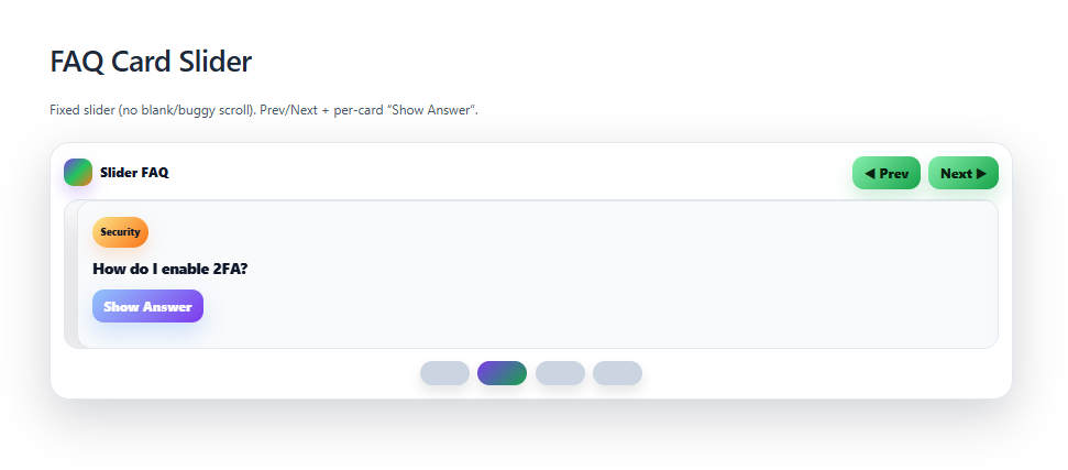
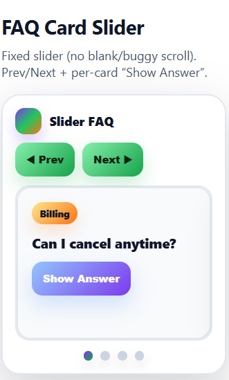
The Card Slider FAQ Template arranges questions as cards that slide horizontally like a carousel. This FAQ template lets users swipe or click through key questions one at a time. It works nicely on mobile, where sideways scrolling feels natural. Use it when you want to highlight a focused set of FAQs instead of a long list.
Royal Light FAQ Template
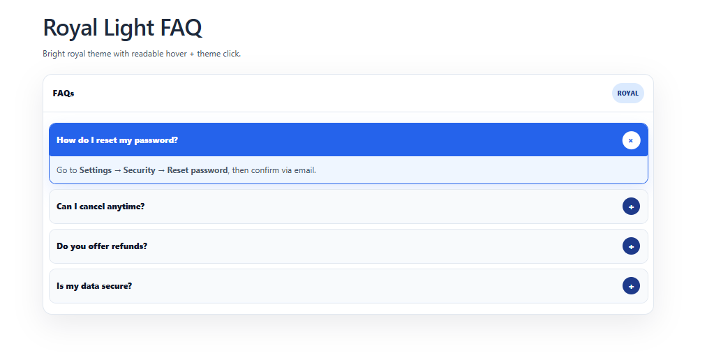
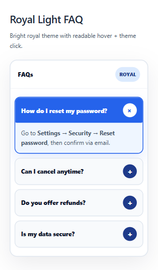
The Royal Light FAQ Template pairs a bright, airy layout with subtle regal touches like gold accents or elegant type. This FAQ template feels premium while staying clean and readable. It gives each question a refined, trustworthy presentation. It’s a good fit for high-end services, education, or professional brands.
Search FAQ Template
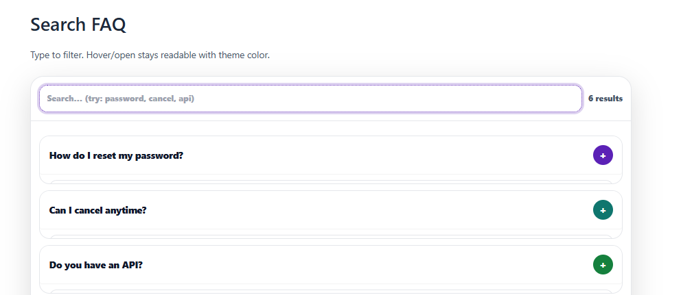
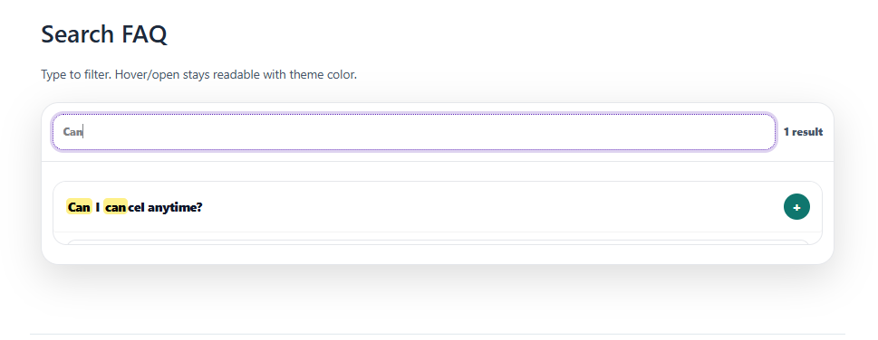
The Search FAQ Template centers the experience around a built-in search bar at the top. This FAQ template helps users type keywords and instantly find relevant answers. Results can filter in place so long lists feel manageable. It’s essential when you have many FAQs and want faster self-service support.
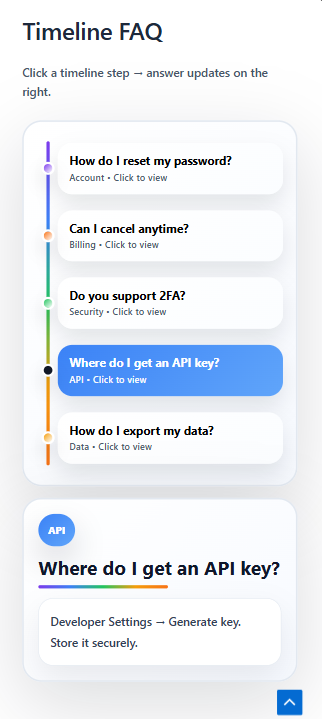
Timeline FAQ Template

")
The Timeline FAQ Template organizes questions along a vertical or horizontal timeline. Users can follow the sequence and open answers where they are in the journey. It’s ideal for onboarding, launches, and process-driven products.
Royal Dark FAQ Template
")
")
The Royal Dark FAQ Template uses a deep, dark background with luxurious accents and strong contrast. This FAQ template makes questions stand out like spotlights on a stage. It feels bold, classy, and slightly dramatic. Choose it when your brand leans into premium, high-impact visuals.
White + Purple FAQ Template


The White + Purple FAQ Template uses a crisp white base with purple highlights for key elements. This FAQ template feels fresh, techy, and a bit playful. Purple draws attention to headings, buttons, or active questions. It’s well suited to SaaS, startups, and creative brands that like a signature color.
Neon Black FAQ Template


The Neon Black FAQ Template combines a dark background with glowing neon lines or accents. This FAQ template gives your FAQs a futuristic, high-energy look. Questions can be framed with bright borders or hover effects. It’s great for gaming, tech, or youth-focused products that want a bold visual identity.
Ocean Teal FAQ Template


The Ocean Teal FAQ Template uses teal tones and soft contrasts inspired by sea colors. This FAQ template feels calm, trustworthy, and modern. Questions and answers are easy to read with gentle dividers and spacing. It’s ideal for wellness, productivity, or any brand that wants a relaxed, refreshing support area.
Sunset FAQ Template
")

The Sunset FAQ Template layers warm gradient shades like orange, pink, and violet. This FAQ template creates a cozy mood while keeping content prominent. Sections can be separated with soft bands of color that echo a sunset sky. It works beautifully for lifestyle, travel, and creative product FAQs.
Lime Tech FAQ Template
")

The Lime Tech FAQ Template uses sharp lime accents over a neutral or dark base. This FAQ template feels energetic, modern, and tech-forward. Bright lime highlights questions, active states, or icons. It’s great for startups and tools that want a clean, futuristic FAQ with a pop of color.
Helpful Buttons FAQ Template
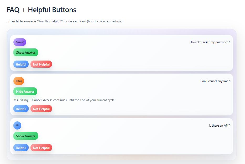
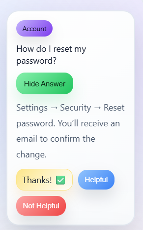
The Helpful Buttons FAQ Template turns common actions into clear, clickable buttons like “Contact Support” or “View Docs.” This FAQ template mixes quick answers with obvious next steps. Users don’t just read; they can immediately act. It’s perfect when your FAQ needs to guide people toward additional help channels.
Chips Category Filter FAQ Template
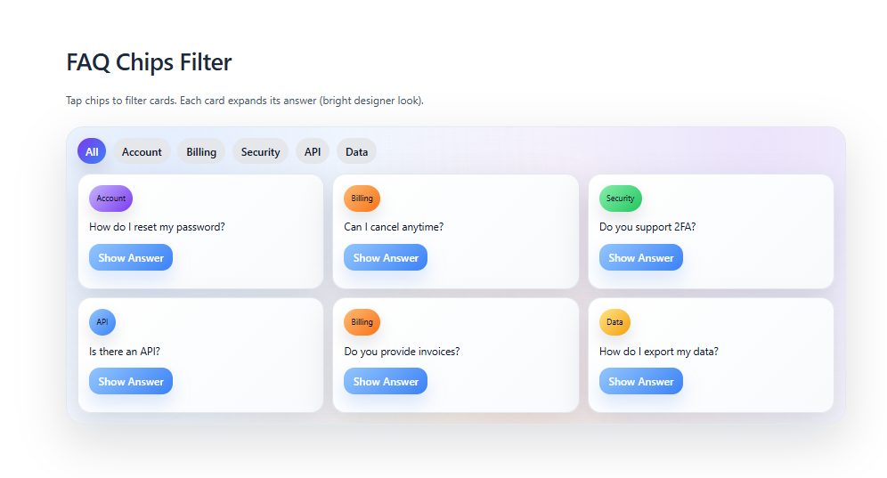
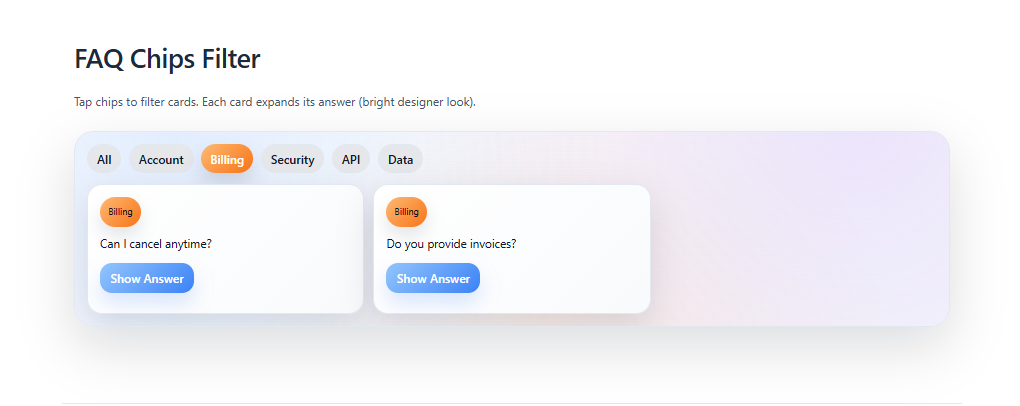
The Chips Category Filter FAQ Template shows categories as small chip-style filters above the questions. This FAQ template lets users tap chips like “Billing,” “Shipping,” or “Technical” to narrow the list. It keeps navigation fast and visual, especially on mobile. It’s ideal for FAQs with clear, repeatable topic groups.
Gradient Accordion FAQ Template
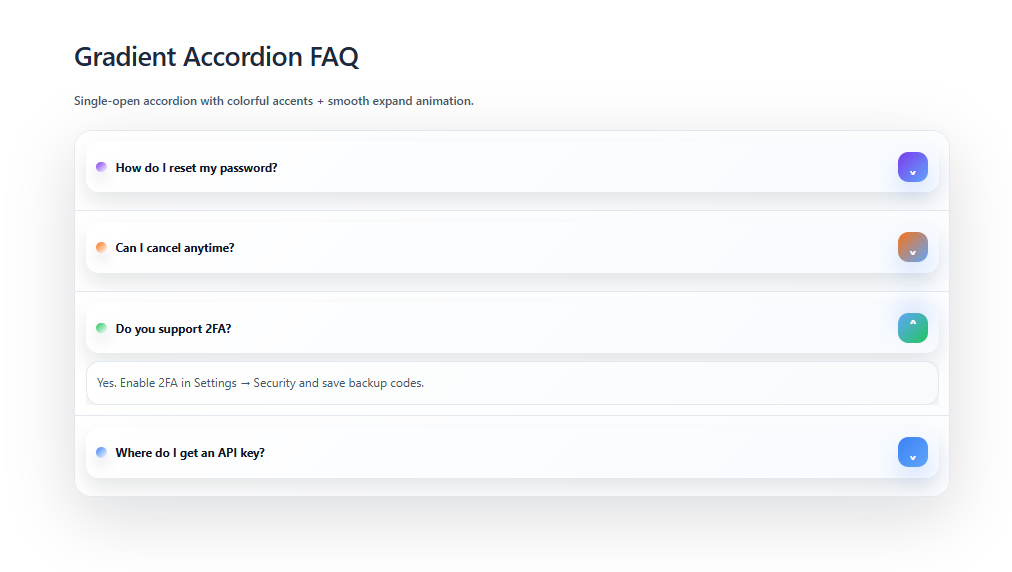
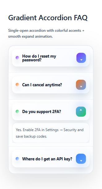
The Gradient Accordion FAQ Template uses an accordion layout with gradient backgrounds on the headers. This FAQ template makes each question bar feel lively and clickable. Answers slide open while the color subtly guides the eye down the list. It’s a nice choice when you want a familiar pattern with a modern twist.
Holo Ticket FAQ Template
")
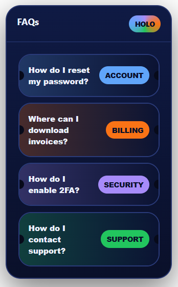
The Holo Ticket FAQ Template styles each question like a holographic ticket or badge. This FAQ template feels playful, shiny, and a bit futuristic. Users can click a ticket to expand and reveal the answer beneath. It’s great for entertainment, events, or any brand that wants a standout, collectible vibe.
Neon Bright FAQ Template
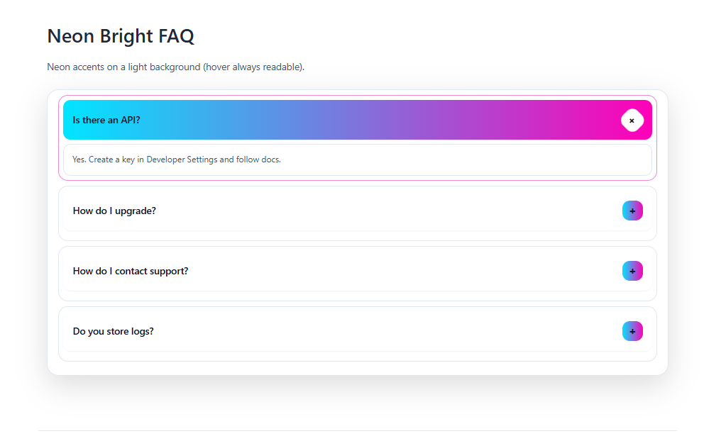

The Neon Bright FAQ Template uses bold neon colors on a light or dark base for maximum contrast. This FAQ template makes important questions hard to miss. Strong hues, icons, and dividers create a lively, energetic layout. It’s perfect when your brand thrives on high-impact visuals and personality.
Carousel FAQ Template
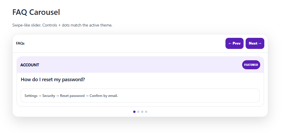
The Carousel FAQ Template displays FAQs as slides in a rotating carousel. This FAQ template focuses users on one group of questions at a time. Arrows or dots let them move through sections in a controlled way. It works well for feature highlights, top questions, or onboarding sequences.
Shelf FAQ Template


The Shelf FAQ Template stacks questions like books or boxes on shelves. This FAQ template gives a tidy, organized feeling, as if everything is stored in its place. Each “shelf” can represent a different category or topic. It’s ideal when you want structure and a slightly playful, editorial look.
Rows FAQ Template
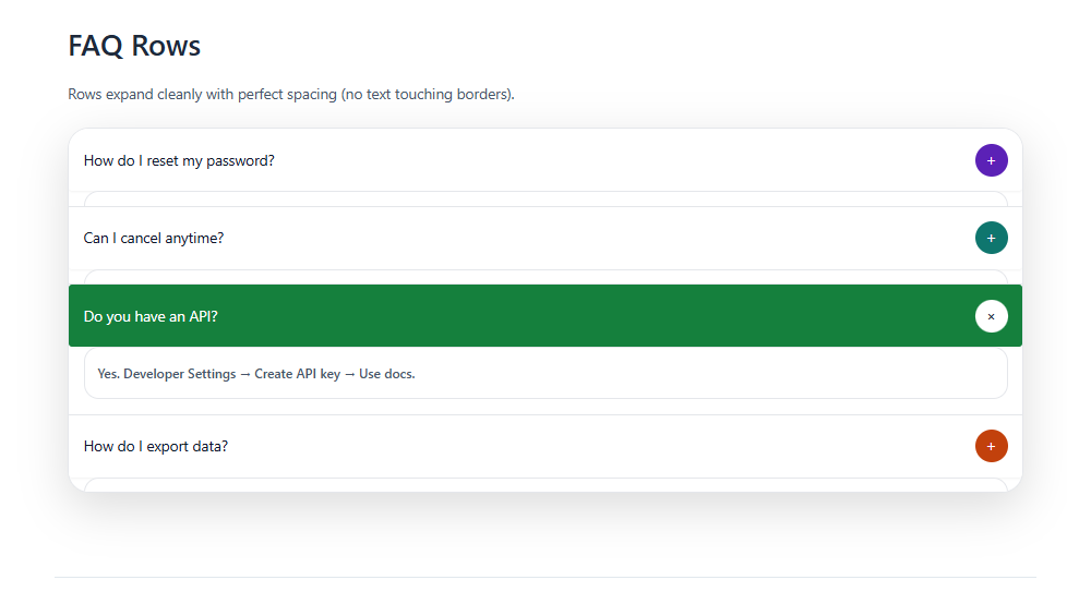
The Rows FAQ Template arranges questions and answers in simple, clean horizontal rows. This FAQ template favors clarity and readability over decoration. Users can quickly scan down the page and open or read each row in order. It’s a solid default when you want a straightforward, no-nonsense FAQ layout.
How to Use These FAQ Templates on Your Website
These FAQ templates are built with simple HTML and CSS so you can drop them directly into almost any website. You’ve already seen the structure of each template, including the FAQ container, questions, answers, and any special effects. The goal now is to turn that code into a complete FAQ page that looks professional and matches your brand. Once you understand the basic steps, you can reuse the same process for any template on this page.
1. Creating Your FAQ Page (Using the Code Above)
Creating your FAQ page starts with choosing the template style you like and then pasting its HTML and CSS into your project. You don’t need any advanced coding skills; you just need to keep the structure and class names intact. After that, you simply swap out the demo questions and answers for your real content. When you’re done, you’ll have a working FAQ section ready to connect with your visitors.
Copy the HTML Structure
Begin by copying the HTML block for the FAQ template you want to use, such as the Answer Drawer, Gradient Accordion, or Carousel layout. This HTML usually includes a main container, each question, and its corresponding answer wrapper. The structure is important because the CSS expects certain class names and nesting. As long as you keep that layout intact, you can safely change the text inside the elements.
Copy the CSS Styles
Next, copy the CSS that was provided alongside that template, because this is what gives the FAQ its shape, colors, and animations. The CSS controls everything from font sizes and spacing to hover effects and transitions. Without it, the HTML would look plain and unstyled. By pasting the exact CSS block, you ensure your template appears exactly as designed.
Paste Into Your Page File
In a simple setup, you’ll have an HTML file like index.html and a stylesheet like style.css. Paste the FAQ HTML into the <body> of your page where you want the FAQ to appear, such as near the bottom or in a dedicated FAQ section. Paste the CSS into your main CSS file or inside a <style> tag in the <head> so it loads when the page is opened. Once linked correctly, the FAQ will pick up all its visual styling automatically.
Update the Questions and Answers
After the layout is visible, replace the placeholder questions like “Question 1” and the sample answers with your own real FAQs. Keep the tags and classes the same, and only edit the text between them so you don’t break the styles or interactivity. This way, you get a fully customized FAQ without needing to touch the underlying layout logic. If you need more questions, you can duplicate an existing FAQ item and then change the content.
Check in the Browser
Once everything is pasted and updated, open the page in your browser and interact with the FAQ. Click the questions to make sure they open, close, slide, or animate as expected for the chosen template. If something looks broken, inspect the HTML to confirm that class names and wrapper elements are still intact. Fix any typos or missing tags, refresh the page, and your FAQ should behave correctly.
2. Customizing the Look & Feel (Fonts, Colors, Spacing & More)
All the visual customization happens in the CSS, and you can easily change it to match your brand without altering the HTML. By tweaking fonts, colors, shadows, spacing, and animation speeds, you can turn a generic template into something that feels fully unique. You do this by targeting the specific classes used for the FAQ container, questions, and answers. A few small adjustments can make the template blend perfectly with the rest of your website’s design.
Change the Global Font
To change the font across the entire FAQ section, update the font-family on the body element or on a wrapper like .faq-container. You can swap the default font for something like "Poppins", sans-serif or any other web-safe or imported font. This instantly changes the personality of your FAQ, making it look more modern, playful, or professional. Because the font is applied globally, you don’t have to edit each question or answer individually.
Adjust Question Font Size
Question titles usually use a class like .faq-question or .faq-header, and that’s where you adjust font-size. Increasing the size makes questions stand out more and helps users quickly scan for what they need. Reducing the size can make the design look more minimal and compact. You can also adjust font-weight to make questions bolder or lighter depending on your style.
Change Question Text Color
The color of question text is controlled by the color property on that same question class. You can set it to a dark neutral like #111 for readability or a brand color like #ff6600 to match your logo. Using consistent colors across buttons, links, and FAQ questions helps unify your design. If you want a subtle effect, you can use slightly softer shades instead of pure black.
Update Answer Text Style
For the answer text, look for a class like .faq-answer and adjust font-size, line-height, and color. Slightly larger line-height makes answers easier to read, especially on mobile devices. You can also choose a softer text color to create a visual hierarchy, where questions are bold and answers feel more relaxed. This small detail can make a big difference in overall readability.
Edit Background Colors or Gradients
Templates such as Gradient Pastel, Sunset, or Lime Tech often use a gradient or solid background on the FAQ container or cards. You can change this with the background or background-color property to match your brand colors. For gradients, you can customize the linear-gradient(...) values to create your own unique blend. A well-chosen background instantly gives your FAQ a distinct visual style.
Control Card Rounding (Border Radius)
Card-like designs use border-radius on elements such as .faq-card or .faq-item to control how rounded the corners are. Smaller values create a sharper, more formal look, while larger values give a soft, modern, pill-shaped style. You can change all corners at once or use specific values to round only top or bottom edges. This lets you match other UI components on your site, like buttons and input fields.
Change Shadows (Depth)
The depth of each FAQ card is usually controlled by box-shadow on the card or container. By adjusting the blur, spread, and opacity values, you can create a subtle floating effect or a more dramatic drop shadow. Lighter shadows often feel clean and modern, while stronger ones can add emphasis to interactive elements. Matching shadow styles with the rest of your interface keeps everything feeling cohesive.
Adjust Padding Inside Each FAQ Block
Padding determines the space inside each card or question-answer block, and it’s set with padding on .faq-card, .faq-question, or .faq-answer. Increasing padding makes the content feel more airy and easier to read, while decreasing it can create a compact, dense design. You can also use different values for top, bottom, left, and right to shape the content area. This is a simple way to refine the overall balance of the layout.
Adjust Spacing Between Questions
The space between each FAQ item is typically controlled by margin-bottom on .faq-item or by gap on a flex or grid container. Changing these values lets you choose between a tightly stacked FAQ and one that feels more open. Wider spacing can help visually separate complex answers, while tighter spacing works well for short, quick questions. This adjustment is especially noticeable on mobile layouts.
Change Width and Alignment
The overall width and alignment of the FAQ section can be controlled by max-width and margin on .faq-container or an outer wrapper. Setting max-width and margin: 0 auto; centers the FAQ and prevents it from stretching too wide on large screens. You can use narrower widths for a more focused central column or wider ones for a full-page experience. These choices help the FAQ feel balanced with your header, footer, and other sections.
Customize Icons (Chevrons, Plus/Minus, Arrows)
If your template uses icons to show open/close states, their appearance is controlled by properties like font-size, width, height, and color. You can make icons larger so they are easier to tap on mobile, or smaller for a clean minimalist look. Changing the color helps indicate whether a question is open or closed. Matching icon colors with your brand accent color keeps the design consistent.
Modify Hover and Active States
Hover and active states are defined using selectors like .faq-question:hover or .faq-item.active. These styles control changes such as background color, border, and text color when a user interacts with the FAQ. By customizing these states, you can make the open question stand out clearly and improve usability. It also adds subtle motion and feedback, making your FAQ feel more interactive and polished.
Adjust Animation/Transition Speed
Animations and transitions are set by properties like transition and animation-duration on the FAQ elements. You can speed things up for a snappier, more responsive feel or slow them down for a smoother, more relaxed effect. This is especially important for sliding accordions or drawers where timing affects perceived quality. A consistent animation speed across your site makes interactions feel intentional.
Tweak Mobile Responsiveness
Mobile behavior is controlled by @media queries in the CSS, which apply different styles at specific screen widths. Inside these blocks, you can reduce font sizes, adjust padding, and sometimes switch the layout from multiple columns to a single column. This ensures that your FAQ looks clean and readable on phones and tablets. Good mobile styling is crucial since many users will access your FAQs from smaller screens.
Change Section Titles and Headings
The main FAQ title and any subheadings use classes like .faq-title or standard heading tags such as h2 and h3. You can adjust their font-size, color, text-align, and margin to match your site’s typography system. A stronger, larger heading signals that this is an important section of your page. Aligning these styles with your homepage and other sections keeps your brand identity consistent.
Use Developer Tools to Inspect Styles
If you are unsure which CSS rule changes a specific part of the FAQ, your browser’s Developer Tools are very helpful. Right-click the element, choose Inspect, and you’ll see which classes and properties are applied. You can even test style changes live in the browser before editing your CSS file. This makes it much easier to understand and fine-tune the design.
3. Adding the FAQ to Different Types of Websites
The same HTML and CSS can be used across many platforms; the only difference is where you paste the code. Generally, the HTML goes into a content area or custom HTML block, while the CSS goes into a global stylesheet or custom CSS section. Once both parts are in the right place, the FAQ will display and behave the same way, whether you are on a custom site, WordPress, Shopify, or a website builder. Understanding this pattern makes it simple to reuse these templates anywhere.
A. Custom HTML / CSS Website
On a custom HTML/CSS website, you have direct control over your files, so integration is very straightforward. You edit your main .html file, paste the FAQ HTML into the <body> exactly where you want it, and save. Then you open your style.css or main stylesheet, paste the FAQ CSS at the bottom or in a relevant section, and make sure the file is linked in the <head>. After refreshing the page, you can fine-tune fonts, colors, and spacing directly in that CSS file.
Add the CSS (Custom HTML / CSS)
Start by locating the main CSS file used by your site, often called style.css or something similar. Paste the FAQ template’s CSS there so it is loaded globally whenever the page is opened. Confirm that the CSS file is linked correctly with a <link> tag in the <head> of your HTML. Once that link is in place, your FAQ will automatically take on its intended styling.
Add the HTML (Custom HTML / CSS)
Next, insert the FAQ HTML into your page file inside the <body> tag, ideally within a dedicated <section id="faq"> or similar container. This tells the browser where to display the FAQ on the page. You can place it after your main content, above the footer, or wherever your layout calls for it. Save the file and reload the page to see the FAQ appear in that location.
Organize Sections (Custom HTML / CSS)
If you want to use multiple FAQ templates across different pages, it helps to wrap each one in its own section with a clear ID or class. This makes it easier to reuse and target specific FAQs with extra CSS or links. You can also create a dedicated FAQ page that contains multiple categories, each using a different template style. Organizing your sections this way keeps your code clean and easier to maintain.
B. WordPress (Classic Editor, Block Editor & Page Builders)
In WordPress, you combine a content area for HTML with a global location for CSS. The FAQ HTML goes into a page, usually titled “FAQ” or “Help”, either as a custom HTML block or through a page builder widget. The CSS is added in the Appearance → Customize → Additional CSS panel or your theme’s stylesheet so it loads across the site. Once both are in place, you can preview the FAQ, adjust the design in your CSS, and reuse the same code on other pages if needed.
Option 1: Gutenberg / Block Editor
With the Block Editor, you create or edit a page and add a Custom HTML block at the exact point where you want the FAQ to appear. You paste the FAQ HTML into that block so WordPress renders the structure correctly. Then you open the Additional CSS area or your child theme’s style.css and paste the FAQ CSS there. After previewing the page to confirm everything looks right, you publish or update the page so visitors can see it.
Option 2: Classic Editor
In the Classic Editor, you edit your FAQ page and switch the editor to Text mode, which lets you paste raw HTML. You insert the FAQ HTML in the content area where you want it displayed and then save or update the page. The CSS is added separately via Appearance → Customize → Additional CSS or by editing your theme’s stylesheet. When you view the front end, the FAQ should appear fully styled, and any future design tweaks can be done directly in the CSS.
Option 3: Page Builders (Elementor, Divi, etc.)
For page builders, you typically drag an HTML or Code widget into the layout and paste the FAQ HTML inside it. This lets you position the FAQ alongside other sections, columns, and widgets visually. You then add the CSS in the builder’s global CSS panel, your theme’s stylesheet, or the site’s custom CSS area so it applies everywhere. After saving and previewing, you can adjust margins and layout in the builder while keeping styling changes inside the CSS.
C. Shopify
In Shopify, you integrate the FAQ by editing theme code and adding a page or section to host the HTML. You place the CSS inside your main theme stylesheet, such as theme.css or base.css, so it loads on every page of the store. The FAQ HTML can be pasted into a dedicated “FAQ” page in HTML view or into a Custom HTML section via the theme customizer, depending on your theme’s options. Once it’s visible, you preview the store on desktop and mobile, then adjust fonts, colors, and spacing in the stylesheet to align with your brand and product pages.
D. Other Platforms (Quick Notes)
On platforms like Webflow, Wix, and Squarespace, the process is similar but uses their built-in embed and code tools. You add an Embed or Custom Code block to your page and paste in the FAQ HTML so it renders in the layout. Then you open the project or site settings to find the global CSS or custom code area and paste the FAQ CSS there so the design loads properly. After publishing or updating the site, you review the FAQ on different screen sizes and, if needed, tweak the CSS
Key Elements Every Effective FAQ Page Should Include
An FAQ template is only as useful as the structure it gives you. The best templates do not just look nice. They make information easier to find, easier to scan, and easier to trust.
Below are the elements that show up repeatedly across the ranking pages you shared, along with the reasons they work.
A clear set of categories that match how users think
Most strong FAQ pages group questions into categories like account, orders, shipping, payments, products, troubleshooting, and general policies.
This is not just organization for organization’s sake. Categories reduce search time. They help users self-select where to look. They also prevent your page from becoming an endless scroll.
If your business has distinct audiences, the category approach can shift slightly. Some brands split by role, like customer versus seller, host versus guest, or admin versus user. This works when the questions differ significantly by persona.
A layout that favors quick scanning
The strongest FAQ pages are designed for scanning first and reading second. That usually means questions that are visible at a glance and answers that appear only when someone clicks or taps. This lets visitors move quickly down the list, stopping only on what applies to them.
Accordion style layouts keep the page tidy while still allowing for depth when needed. They also reduce overwhelm. Instead of dumping a solid wall of text on the user, you let them choose what to open. This pattern is so common now that it has become the default layout for many modern FAQ pages.
A search option for larger FAQ libraries
Once you have more than a small set of questions, a search bar becomes important. It changes the experience from scroll and skim to type, find, and act. For visitors in a hurry, search is often the first thing they look for.
Many of the best FAQ pages include search because it is an instant usability upgrade. People who know exactly what they want, like refund policy or change email address, can jump straight to the relevant answer. Building search into your FAQ shows that you are thinking about real user behavior, not just the layout.
Questions that are short, specific, and written like real queries
A common guideline across top pages is that FAQ questions should be short and direct. You can feel that in the examples you pasted.
Questions like “How do I reset my password?” work because they are precise and actionable. They also reflect real user language.
Avoid vague questions that do not lead to a clear answer. When a question is vague, the answer becomes vague, and vague answers are where trust dies.
Answers that are concise, but not incomplete
A good FAQ answer delivers the resolution first, then adds detail only if needed. Visitors want to know what to do before they care about every possible edge case. A strong pattern is one or two sentences that solve the problem, followed by optional steps, context, or links.
When a topic genuinely needs a longer explanation, high quality FAQ pages do the same thing. They give the short version up front and then point to a full help article, guide, or policy page. This keeps the FAQ readable while still handling complex questions thoroughly.
A natural path to the next step
Even on purely informational FAQ pages, there is usually a logical next step. That might be contacting support, checking an order, changing billing details, downloading an invoice, or reading more detailed documentation. The best FAQs make that path obvious and easy.
Strong pages use gentle calls to action that feel like part of the help, not an ad. A small button, a clearly labeled link, or a simple Still stuck? Contact us can be enough. The goal is not to sell anything here. It is to guide people smoothly to whatever they need to do next.
Accessibility basics that prevent frustration
Many sites forget that an FAQ is a usability feature. If the FAQ is hard to use with a keyboard, screen reader, or mobile device, it fails at its job.
Good templates include proper labels, clickable targets that are easy to tap, and a layout that works on smaller screens. When you publish your template-based FAQ, this is one of the easiest areas to outperform competitors, because many “free templates” look good but ignore usability.
A “living page” mindset
One of the best insights in the content you pasted is the reminder that FAQs are not a one-time project. They change as your product changes.
New features create new questions. Policy changes make old answers wrong. Support trends shift over time.
When you treat the FAQ as a living resource, it stays useful, and usefulness is what earns links, shares, and repeat traffic.
25 FAQ Pages Worth Studying
These FAQ pages are worth studying because they do two things well: they answer real questions quickly and guide visitors to the next step, like tracking an order, updating billing, or starting a return, without feeling pushy. When you create your own FAQ page, these examples show what works: grouped questions, clear language, short answers, and layouts that are easy to scan.
Apple
Apple Support keeps help easy by guiding users through products first, then narrowing into clear topics. It’s great for brands with many products because visitors can quickly choose what they’re using and stay in the right support path. The structure feels calm and predictable, which helps users feel confident while searching.
Amazon
Amazon Customer Service is focused on quick actions people want to do right away. It highlights common tasks like order help, returns, and account access so visitors can move forward without hunting around. This is a strong example of building an FAQ experience around user intent.
Netflix
Netflix Help Center is built for speed and clarity. The page is designed so visitors can search quickly or choose common topics like billing, streaming, and login issues. It’s a good reference for clean FAQ writing because it keeps wording simple and steps easy to follow.
Google Help works well because it’s organized around products first. People choose what they need help with (like Gmail or YouTube) and then see the right set of topics without confusion. This is a strong model for any service that has multiple tools or features.
Spotify
Spotify Support shows how a modern FAQ can feel light and easy to scan. Topics are grouped in a clear way, and the writing is simple and direct. It’s a good example of using friendly wording while still staying clear and useful.
Shopify
Shopify Help Center is a great reference for FAQs that support both learning and action. It helps users understand concepts while also giving practical steps for real tasks like payments, shipping, and store settings. The structure supports quick answers and deeper help without feeling messy.
PayPal
PayPal Help Center builds trust by making important topics easy to find. The headings are direct, and the next steps feel clear, which matters a lot for payments and account-related questions. It’s a strong example of keeping users calm through clear structure and language.
Airbnb
Airbnb Help Center is strong because it supports different user needs in a clear way. Many people come with specific situations, like booking changes or hosting questions, and the page helps guide them quickly. It’s a helpful model for FAQs that serve multiple types of users.
Microsoft
Microsoft Support handles a huge amount of topics while still staying structured. Good categorization and strong search help visitors find the right path quickly. This is a great example of how to keep an FAQ system usable even at large scale.
Slack
Slack Help Center is known for simple language and action-focused help. The answers often feel like real instructions, not just definitions, which makes the experience more practical. It’s a great reference for writing FAQs that feel helpful and human.
Etsy
Etsy Help Center matches topics to how buyers and sellers think. Questions around orders, shipping, refunds, and accounts are grouped in a way that feels natural for shopping journeys. It’s a strong example of using customer-friendly wording.
Stripe
Stripe Support is a great model for technical FAQ writing that stays clear. The structure feels consistent, and topics are written to help users move step-by-step. It’s especially useful if your FAQ needs to explain systems, payments, or developer-related workflows.
Cloudflare
Cloudflare Help Center is a strong example of problem-solving organization. It helps users move from “what’s happening” to “what do I do next” with clear sections and clear language. It’s a great reference for technical FAQs that still need to stay readable.
Mailchimp
Mailchimp Help Center blends short FAQ-style questions with deeper guides in a smooth way. Visitors can get quick answers but also follow clear paths when they need setup help or step-by-step instructions. It’s useful for learning-focused products.
WhatsApp Help Center is a great example of tight, direct FAQ wording. Topic names are short, clear, and easy to scan. It’s especially useful if you want to keep questions specific and avoid long, confusing titles.
Zendesk
Zendesk Help Center is built like a real support system where users want quick results. It supports fast browsing while also offering deeper paths for complex topics. It’s a good reference for FAQ structure that supports both quick fixes and detailed help.
Adobe
Adobe Help Center shows how large brands keep help consistent across many products. The organization makes it easier for users to choose the right tool and then find relevant topics. It’s a good model for FAQs that cover multiple services or plans.
McDonald’s
McDonald’s FAQ is a useful example of simple consumer-focused help. The questions are straightforward and focus on common needs like orders, apps, and offers. It’s a strong reminder that clarity matters more than fancy design.
Nintendo
Nintendo Support is helpful for category-heavy systems. It uses clear navigation and topic grouping so people can jump to the right section without scrolling endlessly. It’s a good reference for FAQs that cover devices, accounts, and troubleshooting.
Upwork
Upwork Help supports different audiences while staying organized. Freelancers and clients often have different questions, and the help experience keeps those paths clear. It’s a strong model for marketplaces or platforms with multiple user roles.
Vrbo
Vrbo Help organizes help around real travel actions like bookings, cancellations, payments, and hosting needs. The categories feel familiar and easy to scan, which matters when visitors need quick answers. It’s a good reference for travel and booking FAQs.
Wistia
Wistia Support keeps help content clean while still making support options easy to find. The structure supports self-serve answers while guiding users toward the right resources. It’s a solid example for SaaS-style FAQ sections.
WordPress.com
WordPress.com Support often turns questions into short learning steps, which helps beginners feel guided. The structure makes it easy to start simple and go deeper when needed. It’s a good model for FAQs that also teach users how to use the product.
GitHub
GitHub Docs shows how complex topics can still be organized in a clear way. Strong headings, consistent page structure, and good navigation reduce the effort required to find answers. It’s a great reference for structured help writing.
Notion
Notion Help Center keeps answers focused and language simple. It guides users by common tasks and avoids overloading pages with extra text. It’s a great example of modern FAQ style that feels clean, direct, and easy to follow.
Layout Ideas for Modern FAQ Templates
Below are a few modern FAQ templates that show different layout styles, from clean category sections to simple accordion designs. Each style keeps questions easy to find and answers easy to read, so visitors can scan the page quickly and move forward with confidence.
These examples can help you choose a structure that fits your content and the way your visitors search for information. With the right layout, your FAQ can look modern, feel organized, and stay easy to update as your questions and answers grow over time.

1. Kinetic Typography Header FAQ Template

2. Colored Right Drawer Answers FAQ Template

3. Colored Tag Cloud Answer Panel FAQ Template

4. Ecommerce Colorful Help Center FAQ Template
")


13. Colored Grid Oversized Cards FAQ Template

14. Rainbow Category Chips FAQ Template

15. Gradient Wave Divider Sections FAQ Template
")
16. Gradient Stack FAQ Template (Search + Expand Card)


")
")


25. Folded Paper Cards FAQ Template

26. 3D Blob Layered Accordion FAQ Template

27. Bold Color-Block Category FAQ Template

28. Colored Diagonal Slash Cards FAQ Template

29. Colored Pattern Strip Split Background FAQ Template

30. Colored Bubble Cards FAQ Template