Understanding How to Optimize Your B2B Homepage for Conversions
Your B2B homepage works like a doorway for visitors who want to understand your business quickly and clearly. It should give them an easy path to explore what you offer, how you help, and why they should continue learning about you. A clear homepage can guide people who may not know much about your business and help them move from being curious to wanting to know more. Many B2B buyers look for pages that feel simple, steady, and easy to follow, and that is why your homepage must be shaped with care. The following sections explain simple and practical ways to make your homepage strong for conversions so visitors feel confident moving ahead with you.
1. Create a Clear First Impression
A visitor’s first experience on your homepage shapes how they feel about your company. When they land on your page, they should see clarity, calm design, and guidance that directs them in a simple way. A clear first impression helps visitors understand where to go next without feeling lost. Your homepage should also keep a balanced look so that people do not feel overwhelmed, especially those who may be scanning quickly. A strong first impression can reduce the chance of visitors leaving too soon and increase the chance of them wanting to explore more about your services or products.
1.1 Craft a simple headline that explains your value
Your headline should explain your value in a few easy words that make sense even to someone with no background in your industry. It should give a clear picture of what you help with so the visitor does not need to think too hard. A short headline can help your page feel calm and friendly, making the visitor feel like they are in the right place. This can be supported by a small subtext that adds a bit more detail while staying clear. When visitors can understand your value fast, they feel more comfortable to scroll further instead of leaving quickly. Tools like Grammarly can help you keep your message clear by checking your sentence structure. Keeping your headline direct helps the rest of your homepage feel like a natural guide for people who want to explore your services.
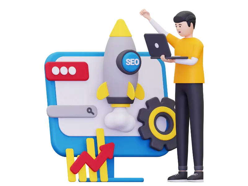
1.2 Use simple and friendly visuals that support understanding
Images and graphics on your homepage should connect with the message you are sharing. They should help visitors understand what you do without confusing them or creating noise on the page. Simple visuals that match your brand colors make your homepage feel stable and trustworthy. Avoid busy designs that make the visitor focus on the wrong areas. A calm visual layout can lead the visitor’s attention to the main parts of the page, such as your headline or key benefits. This helps guide their eyes in a natural path. When visuals work with the text, the visitor can understand your message better, and this improves how they interact with the rest of the page.
1.3 Keep the layout clean and easy to scan
A clean layout helps visitors move through your homepage at a steady pace without getting stuck. Use spacing that makes your content breathe so people do not feel crowded. When sections are well separated, the visitor’s eyes can relax and focus on each part easily. This also makes your homepage feel organized and simple to follow. Even people who only skim can quickly understand the main points. A clear layout also helps guide visitors toward your call-to-action button naturally. This sense of order makes the whole page feel more welcoming and builds trust in your business.
1.4 Make your call-to-action visible and natural
Your call-to-action should appear in a place where visitors can see it without forcing their attention. It should feel like a natural next step rather than a pushy request. Use simple words like “Learn More” or “Get Started” to keep the tone friendly. A clear button with enough space around it helps people notice it easily. When you place this button near your value message, visitors feel guided instead of pressured. This smooth flow can increase the chance of them clicking and moving ahead in their journey with your business. Many companies use website builders like Webflow to place call-to-action buttons cleanly in the design without clutter.
1.5 Add short proof that builds trust right away
Your homepage can feel more trustworthy when you add small signs of proof near the top. This could be a short client list, a gentle quote, or small data points that show experience. These proof elements should stay simple and small so they do not take over the page. Their purpose is to quietly support your value so visitors feel confident you know what you are doing. When placed carefully, this helps visitors feel safe to scroll and explore more about you. It also helps them see that you have worked with others and delivered results before.
2. Make Navigation Easy and Clear
Navigation guides your visitors through the parts of your website. When it is simple and steady, people can find what they need without frustration. A clear menu helps visitors explore more sections, which increases the chance of them finding details that interest them. Many B2B buyers come with specific needs, so your navigation should be shaped to help them find important information without difficulty. A simple navigation bar gives the homepage a calm feeling and avoids confusion. Making your navigation easy also helps visitors feel confident that your business is organized and thoughtful.
2.1 Keep menu items short and easy to understand
Menu items should be short enough for anyone to understand at a glance. Avoid long or complex words that may confuse visitors who might not know your industry terms. Simple words like “Services,” “Pricing,” “About,” or “Contact” help visitors recognise where they should go. This helps the menu feel friendly and reduces the time they spend thinking about which tab to click. When menu labels are easy, the whole website becomes easier to explore. Visitors feel more in control and are more likely to continue browsing. A simple menu also supports a cleaner homepage layout.
2.2 Limit the number of menu items for a calm experience
A long menu with too many options can make your homepage feel heavy and difficult to use. When you limit the menu to a small number of items, visitors can focus on what matters most. This helps guide them toward the right areas without confusion. It also makes the top of your homepage look cleaner and more stable. Try to group related information under a single tab if needed, so you keep your navigation simple. A small number of choices feels much more welcoming and helps visitors continue their journey on your website easily.
2.3 Use a smooth and visible call-to-action in the menu
A call-to-action in the menu can help visitors take a quick step when they are ready. This should be placed in a calm and visible spot, usually on the right side. Keeping the words short helps visitors understand what they are clicking. Putting it in the menu helps visitors find it again no matter which page they explore. This steady placement increases the likelihood of conversions because visitors feel like they have a clear next step. When done well, this adds to the sense of order on your homepage and keeps the visitor moving naturally through your website.
2.4 Ensure the navigation works well on mobile devices
Many B2B buyers use tablets or phones to visit websites. Your navigation should adjust smoothly to small screens so visitors do not feel frustrated. A simple mobile menu feels neat and helps visitors tap easily without confusion. Small spacing and clear labels also make the page easier to read on a phone. When visitors can explore your site comfortably on any device, they are more likely to stay longer. This increases chances for conversion because they can read and understand your content clearly.
2.5 Keep navigation consistent across all pages
Consistency helps visitors feel stable while moving around your site. When the menu stays the same across every page, visitors do not need to relearn where things are. This reduces confusion and helps them explore faster. A steady menu makes your website feel professional and organized. Visitors who can move around easily are more likely to visit important pages that help them make decisions. Keeping things consistent also builds trust because it shows you care about their experience.
3. Highlight Benefits and Solutions Clearly
Your homepage should explain the benefits of your service in a calm and honest way. People want to know how your business helps them in simple words. Showing solutions clearly helps visitors understand why you may be the right choice without needing to search too deeply. This reduces confusion and helps them connect with your business faster. When benefits are easy to read, visitors feel more confident in exploring further and may convert at a higher rate. Clear benefits also give structure to your homepage, helping people move smoothly from one section to the next.
3.1 Use simple wording to explain each benefit
Explaining benefits in short and easy sentences helps visitors take in the information quickly. Even people who do not know much about the industry can understand it easily. Avoid complex phrases that make people slow down or feel unsure. Simple wording keeps the reader comfortable and encourages them to continue reading. Clear benefits make your business feel straightforward and ready to help. This builds confidence and improves the chances of the visitor taking action on your page.
3.2 Keep each benefit focused on one clear point
Each benefit should talk about one idea so visitors can understand it without mixing details. When you try to say too much in one place, it can become confusing. Keeping each point simple helps visitors remember what they read. It also helps the design look clean because each benefit becomes a neat section on the page. A focused message helps guide the visitor’s mind toward understanding the real value of your service. This simple clarity makes your page more effective and improves engagement.
3.3 Add small examples to make benefits feel real
Examples can help people picture how your service fits into real situations. These examples should stay simple and short so they add value without becoming stories. When a visitor can picture your solution, they feel closer to understanding how it would help them. You can mention a basic example like how a team may save time or how a tool like Trello might connect with your service for better organization. These examples should feel natural and should support the message gently. This adds clarity and increases trust.
3.4 Use small icons to help visitors scan benefits easily
Icons help guide the eye and make benefits simple to find even when a visitor is only skimming. These icons should be soft and clean so they do not distract from the message. A small icon near the text creates a sense of balance and helps the page feel more welcoming. Icons also help break up long sections of text, making the content feel lighter. Visitors appreciate visual cues because they help them follow the flow easily. This improves readability and keeps people moving down your page.
3.5 Position key benefits near the top for quick understanding
Visitors often look at the top section of your homepage first. Placing key benefits here helps them see value quickly. This prevents confusion and keeps their interest longer. When your main benefits appear in the first part of the page, visitors feel assured that they are in the right place. They do not need to scroll a lot to find what matters. This placement increases the chances of them continuing to explore more of your homepage and eventually converting.
4. Add Social Proof That Feels Real and Honest
Social proof helps visitors feel safe because they can see that others have trusted and used your service before. This section should feel calm and natural so people do not feel like they are being overly persuaded. Honest proof builds trust and makes your business feel stable. When a visitor reads simple and real experiences from other customers, they feel more confident moving forward. Social proof can help remove doubts and guide the visitor gently toward taking action.
4.1 Use simple client logos without making them too large
Client logos help visitors see that real companies have trusted your business. The logos should be placed in a simple row or grid so they look clean and stable. They should not be too large because that can make the section feel heavy. Keeping them small helps them blend into the page naturally. Visitors can glance at them without feeling interrupted. When placed gently, logos add a soft layer of trust that helps the visitor feel more comfortable exploring the rest of the site.
4.2 Add short quotes that sound like real people speaking
Short quotes help visitors hear real voices from past clients. These quotes should sound natural and simple, like someone explaining their experience in plain words. They should not feel exaggerated or overly positive. A natural tone helps the visitor believe the words more easily. Quotes that describe simple outcomes or genuine appreciation can build quiet trust. This helps visitors feel that your service works in real situations. Honest words from others make your homepage feel warm and open.
4.3 Keep case studies simple and easy to read
Case studies should be short and focused so visitors can understand the main point quickly. They should explain the problem, the action, and the result in simple terms. Avoid complex details that make the reader slow down. A clear structure helps visitors follow the story without confusion. When case studies feel easy, people are more likely to read them. This can help them see how your service could solve their own problems. Simple case studies create a sense of proof without overwhelming the page.
4.4 Use small data points only when needed
Data points like numbers or percentages can help show results, but they should be used carefully. Only include numbers that add real clarity. Too many data points can make the page feel crowded or pushy. Small numbers placed gently can help support your message without taking over. When used sparingly, data points help the visitor understand results in a clear and steady way. They give a sense of measurable success that builds trust quietly.
4.5 Keep the social proof section calm and well spaced
Spacing around your social proof helps the section feel relaxed and clear. When elements are placed too close together, visitors may feel overwhelmed. Good spacing allows each part of the proof to stand out gently. This makes it easier for visitors to read and absorb the information. A calm layout helps the visitor stay on the page longer and helps them feel more comfortable trusting your business. Good spacing also makes the homepage look more polished and organized.
5. Guide Visitors With Strong and Simple Calls-to-Action
Your calls-to-action should help visitors take the next step easily. They should feel like simple invitations instead of pressure. Clear CTAs guide visitors through your homepage and help them understand what they can do next. This helps move them closer to becoming leads or customers. A good CTA is placed naturally and written in simple words. It should make visitors feel ready to continue without hesitation. This section explains how to shape CTAs that help conversions in a calm and smooth way.
5.1 Use short and clear phrases for call-to-action buttons
Short phrases help visitors understand what the button will do. Clear wording like “Get Started” or “See Pricing” helps guide them instantly. Long or complex phrases can slow people down. When CTAs are written simply, visitors feel more comfortable clicking. These short phrases work well because they do not feel pushy. They gently guide visitors forward and make the experience smooth.
5.2 Place call-to-action buttons in natural points on the page
Buttons should appear in places where visitors naturally pause or finish reading something important. These spots make the next step feel logical. When buttons appear in the right places, visitors do not feel lost. They know exactly what to do if they want to move ahead. Proper placement keeps your homepage easy to follow and improves the chance of conversions. This gentle guidance helps visitors feel cared for as they explore the page.
5.3 Keep the button design clean and easy to notice
A clean button helps the visitor spot the CTA without distraction. Simple colors and clear text make the button stand out in a natural way. The button should not be too flashy because that can feel pushy. A calm design creates trust and helps visitors feel safe clicking. Keeping the style simple also matches well with a clean homepage layout. This gives visitors a steady and clear experience.
5.4 Use one main call-to-action to avoid confusion
Having too many CTAs can make visitors unsure about what to do. One main CTA keeps the page focused and reduces confusion. When visitors see one clear step, they are more likely to take it. Other supporting CTAs can appear further down the page but should stay small. This simple direction helps visitors move forward smoothly. It also helps keep the page clean and organized.
5.5 Make sure the CTA works well on all device types
Visitors may use phones, tablets, or computers. The CTA should be easy to tap or click on all devices. A button that is too small can cause frustration. Proper spacing around the button makes it easier to use. When your CTA works on every screen, visitors can take the next step at any time. This improves your chances of converting mobile users, who make up a large part of online traffic today.
6. Improve Homepage Speed and Smooth Performance
A homepage that loads fast helps visitors stay longer and explore calmly. Slow pages can cause frustration and lead people to leave before reading anything. Speed creates a pleasant experience and makes your business feel professional. Smooth performance also helps your visuals, text, and CTAs appear clearly without interruption. This makes the whole homepage feel easy, steady, and trustworthy. When your homepage works well, visitors feel more comfortable moving through it.
6.1 Keep image sizes small to load faster
Large images can slow down your homepage. Keeping them small helps the page appear quickly. Visitors expect pages to load fast, and even a short delay can make them leave. Simple and light images create a pleasant experience. Tools like TinyPNG can help reduce file size without losing quality. A fast-loading homepage helps visitors see your message right away. This increases the chance that they stay and explore.
6.2 Use simple design elements to keep loading smooth
Too many design elements can make the page feel heavy. Simple designs help the page run smoothly on all devices. When elements load fast, visitors feel like the page is easy to use. Simple shapes, soft colors, and calm spacing help the homepage feel balanced. Visitors can move through the page without getting stuck. This improves their overall experience and helps retain their attention for longer.
6.3 Reduce unnecessary scripts to improve performance
Extra scripts on your homepage can slow things down. Removing the ones you do not need helps the page load faster. A light page creates a smooth experience for the visitor. When the page works well, visitors feel more ready to explore. This leads to better engagement and conversions. A page with fewer scripts also feels cleaner and simpler overall. This calm performance supports your homepage structure.
6.4 Ensure your homepage loads quickly on mobile internet
Some visitors use slower connections on their phone. A homepage that loads fast on mobile helps them stay. You can make adjustments like reducing file sizes or using fewer heavy elements. When mobile users have a smooth experience, they feel more comfortable reading your content. This improves your chances of turning mobile visitors into leads. A fast mobile page shows care and respect for their time.
6.5 Test your homepage speed often to maintain performance
Testing your homepage speed helps you catch issues early. Speed can change when you add new elements or update the design. Regular tests help you keep the page light and fast. This practice ensures visitors always enjoy a steady experience. Tools like PageSpeed Insights can help you see how your page performs. When you keep your homepage fast, you support better engagement and higher conversions.